# Featured Collection
The **Featured Collection** section in Shopify allows you to highlight a specific collection of products on your store’s homepage or other pages. This helps showcase **popular, new, or seasonal items**, making it easier for customers to browse curated selections.
{% hint style="success" %}
* Navigate to **Shopify Admin > Online Store > Themes**.
* **Click** Customize on your active theme.
* **In the Theme Editor**, click **Add Section > Featured Collection**
{% endhint %}
{% hint style="info" %}
Create a product and assign the created collection in the customizer
{% endhint %}
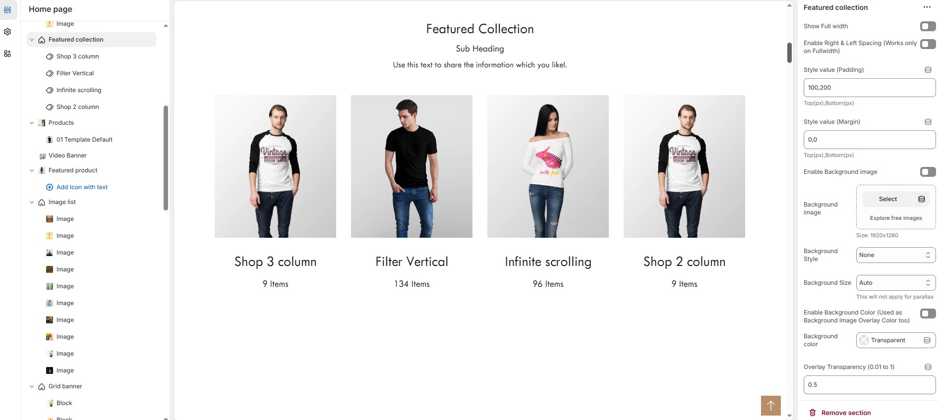
### **Featured Collection Section & Customization Options**
* **Show Full Width:** Expands the featured collection section across the entire screen width.
* **Enable Right & Left Spacing (Works only on Fullwidth):** Adds spacing on both sides (works only in Full Width mode).
* **Style Value (Padding ) :** Adjust the inner spacing above and below the section. Top(px), Bottom(px).
* **Style Value (Margin ) :** Adjust the outer spacing above and below the section. Top(px), Bottom(px).
* **Enable Background Image:** Allows adding a background image for the section.
* **Background Image:** Upload the image (Recommended size based on design requirements).
* **Background Style:** Choose background style **( Fixed, Parallax, or None )**.
* **Background Size:** Choose background size **( Auto, Cover, Contain, Repeat)**.
* **Enable Background Color:** Enable a background color (also used as an overlay color).
* **Overlay Transparency:** Adjust the transparency of the overlay (value between 0.01 and 1).
* **Main Heading:** Customize the Main heading.
* **Sub Heading:** Add a short text to the content.
* **Description:** Add text to share information about the collection.
* **Link Text:** Customize the text for the clickable link.
* **Link URL:** Paste a URL or search for an internal link.
### **Section Color Settings**
* **Heading Color:** Customize the heading color (Set Your Preferred Color).
* **Sub Heading Color:** Customize the sub-heading color (Set Your Preferred Color).
* **Description Color:** Customize the description text color (Set Your Preferred Color).
* **Button Background Color:** Customize the button background color (Set Your Preferred Color).
* **Button Text Color:** Customize the button text color (Set Your Preferred Color).
* **Button Hover Background Color:** Customize the hover background color for buttons (Set Your Preferred Color).
* **Button Hover Text Color:** Customize the hover text color for buttons (Set Your Preferred Color).
* **Heading position** : Choose heading position**( Left, Right, Center )**.
### **Display Settings**
* **Items per Row:** Choose the number of items displayed per row (maximum 2 for list style). will not work if carousel is enabled.
* **Banner Style:** Choose between **( Grid, List, or Overlay )**.
* **Column Gap:** Customizer spacing between columns.
* **Enable Equal Height:** Ensures all items have equal height (Only for Grid Style).
* **Minimum Height (Overlay Style):** Adjust the height.
* **Enable Box Shadow:** Adds a shadow effect to the collection.
* **Collection Border Radius:** The border corners can be rounded using the collection border-radius property. (Leave empty for default border radius).
### **List Style Content Width**
* **Desktop:** Defines how content and image are split (Eg., 50 / 50 ).
* **Laptop (Small Screen):** Defines the layout for smaller screens.(Eg., 35 / 65 ). Mobile resolution defaults to 100/100
### **Carousel Settings**
* **Enable Carousel:** Activate the sliding effect for product display.
* **Enable Auto Height:** Adjust height dynamically based on content.
* **Autoplay Timing:** Customize the rotation timing (Use 0 to stop auto-rotate).
* **Slides per Row:** Choose the number of slides per row.
* **Enable Carousel Pagination:** Display pagination dots for navigation.
* **Carousel Pagination Alignment (Only bottom):** Choose pagination alignment **(Left Aligned, Center Aligned, Right Aligned)**.
* **Enable Navigation Arrows:** Enable next/previous arrows for navigation.
* **Navigation Arrows Position:** Choose navigation arrow position **(Top left, Top center, Top bottom, Center, Bottom left, Bottom center, Bottom right).**
* **Navigation Button Background Color:** Customize the background color (Set Your Preferred Color).
* **Navigation Button Icon Color:** Customize the icon color (Set Your Preferred Color).
* **Navigation Button Hover Background Color:** Customize the hover background color (Set Your Preferred Color).
* **Navigation Button Hover Icon Color:** Customize the hover icon color (Set Your Preferred Color).
* **Navigation Dot Color:** Customize the color of navigation dots (Set Your Preferred Color).
* **Navigation Dot Active Color:** Customize the active navigation dot color (Set Your Preferred Color).
### **Advanced Customization**
* [**Custom Class:**](https://bt-shopify.gitbook.io/trally/custom-class) The Shopify allows you to apply unique CSS styles to specific sections, blocks, or elements within your theme.
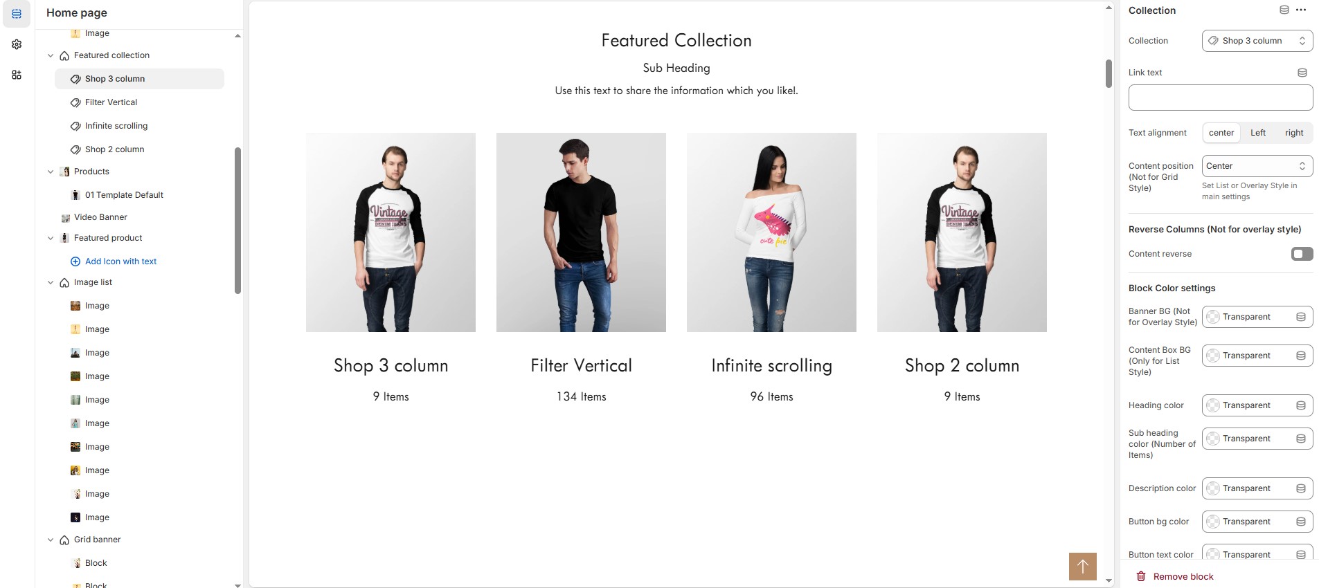
### **Add Collection** **Customization Options**
* **Collection:** Choose a collection assigned in backend[ **(Product Creations)**](https://bt-shopify.gitbook.io/trally/product/creating-products) **(creating collection).**
* **Link text :** Set the text of action clickable
* **Text Alignment :** Choose text alignment **(Left, Right, Center)**.
* **Content position:** Choose the position **(Top left, Top center, Top right, Center left, Center, Center right, Bottom left, Bottom center, Bottom right).**
* **Reverse Columns** : Swap the order of text and images (Not available for Overlay Style).
### **Block Color Settings**
* **Banner Background (Not for Overlay Style)** : Customize the banner background color (Set Your Preferred Color).
* **Content Box Background (Only for List Style)** : Customize the content box background color (Set Your Preferred Color).
* **Heading Color** : Customize the heading color (Set Your Preferred Color).
* **Subheading Color** : Customize the sub heading color (Set Your Preferred Color).
* **Description Color** : Customize the description color (Set Your Preferred Color).
* **Button Background Color** : Customize the button background color (Set Your Preferred Color).
* **Button Text Color** : Customize the button text color (Set Your Preferred Color).
* **Button Hover Background Color** : Customize the button hover background color (Set Your Preferred Color).
* **Button Hover Text Color** : Customize the button hover text color (Set Your Preferred Color).
### **Overlay Settings**
* **Overlay Style** : Choose overlay style **(Normal overlay and Gradient overlay)**.
* **Overlay Color** : Customize the overlay color (Set Your Preferred Color).
* **Overlay Opacity** : Adjust the transparency of the overlay (value between 0.01 and 1).
* **Gradient Position** : Customize the gradient angle (0 to 360) only for gradient overlay.