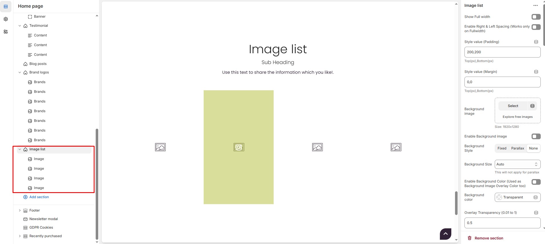
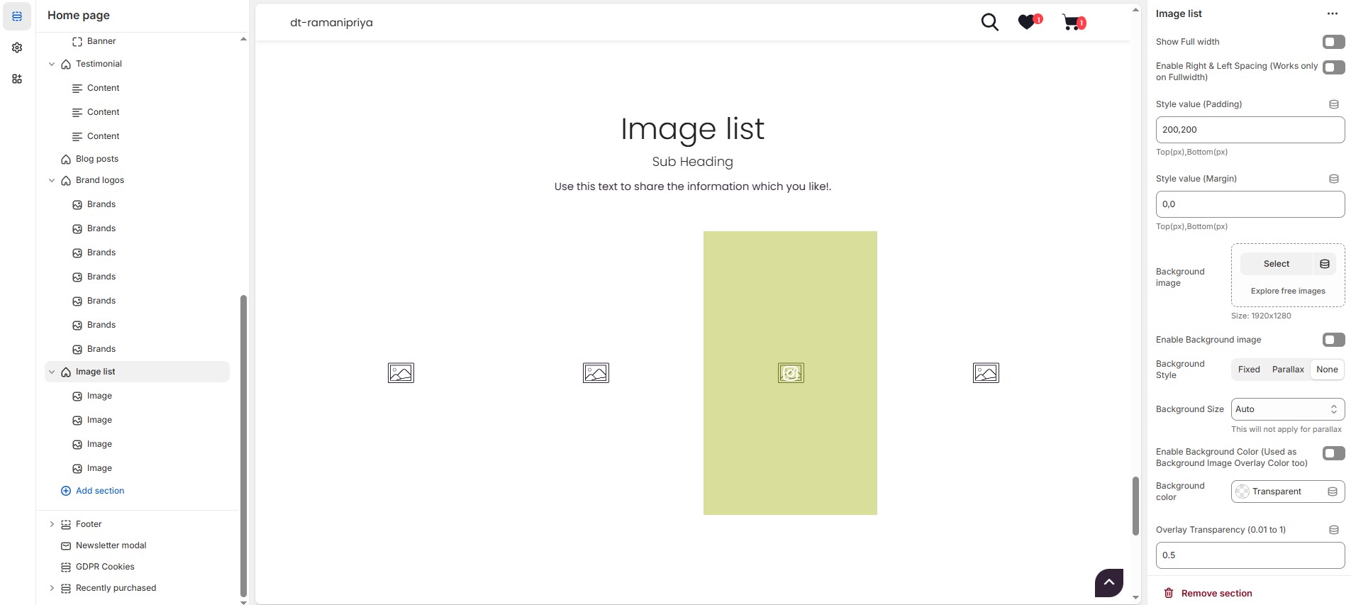
# Image list
The **Image List Section** in Shopify allows you to display multiple images in a customizable grid or carousel format. It’s perfect for showcasing product categories, brand visuals, or featured collections. You can adjust the layout, spacing, colors, and interactive elements to enhance user experience.
{% hint style="success" %}
* Navigate to **Shopify Admin > Online Store > Themes**.
* Click **Customize** on your active theme.
* Select **Add Section > Image List**.
{% endhint %}
### **Image List Section Settings**
* **Show Full Width:** Expands the section across the entire screen width.
* **Enable Right & Left Spacing(Works only on fullwidth):** Adds spacing on both sides (Works only in Full Width mode).
* **Padding (Top, Bottom):** Adjust the inner spacing above and below the section. Top(px), Bottom(px).
* **Margin (Top, Bottom):** Adjust the outer spacing above and below the section. Top(px), Bottom(px).
* **Background Image:** Upload the image.
* **Enable Background Image:** Allows adding a background image for the section.
* **Background Style:** Choose background style **( Fixed, Parallax, or None )**.
* **Background Size:** Choose background size **( Auto, Cover, Contain, Repeat)**.
* **Enable Background Color** **(Used as Background Image Overlay Color too):** Enable or disable the overlay effect to the background.
* **Background Color :** Customize the background color (Set Your Preferred Color).
* **Overlay Transparency:** Adjust the transparency of the overlay (value between 0.01 and 1).
* **Main Heading:** Customize the Main heading.
* **Sub Heading:** Add a short text to the content.
* **Description:** Add text to share information about the section.
* **Link Text:** Customize the text for the clickable link.
* **Link URL:** Paste a URL or search for an internal link.
### **Section Color Settings**
* **Heading Color**: Customize the main heading color (Set Your Preferred Color).
* **Sub Heading Color**: Customize the sub-heading color (Set Your Preferred Color).
* **Description Color**: Customize the description text color (Set Your Preferred Color).
* **Button Background Color**: Customize the button background color (Set Your Preferred Color).
* **Button Text Color**: Customize the button text color (Set Your Preferred Color).
* **Button Hover Background Color**: Customize the hover background color of the button (Set Your Preferred Color).
* **Button Hover Text Color**: Customize the button text color on hover (Set Your Preferred Color).
* **Heading Position :** Choose heading position **( Center, Left, Right ).**
### **Block Settings**
* **Items per Row**: Choose the number of items displayed per row .
* **Column Gap**: Customizer spacing between columns.
* **Gallery Link Text**: Customize the text for the clickable link.
* **Gallery Link URL:** Paste a URL or search for an internal link.
### **Item Height Settings**
* Customize height based on device
{% hint style="success" %}
**Recommended Minimum Slide Heights:** Desktop – 450px | Laptop – 400px | Tablet – 350px | Mobile – 300px **(You can set the responsive size as per your needs.)**
{% endhint %}
### **Image Link Color settings**
* **Gallery Link Background Color**: Customize the gallery link background color (Set Your Preferred Color).
* **Gallery Link Text Color**: Customize the gallery link text color (Set Your Preferred Color).
* **Gallery Link Hover Background Color**: Customize the gallery link hover background color (Set Your Preferred Color).
* **Gallery Link Hover Text Color**: Customize the gallery link hover text color (Set Your Preferred Color).
* **Gallery Icon Color**: Customize the gallery icon color (Set Your Preferred Color).
* **Gallery Overlay Color**: Customize the gallery overlay color (Set Your Preferred Color).
* **Icon Size**: Adjust the icon size (Eg.,24)
### **Carousel Settings**
* **Enable Carousel**: Activate the sliding effect for product display.
* **Adjust Space**: Allows space adjustment if pagination is disabled.
* **Enable Auto Height**: Adjusts height automatically based on content.
* **Slides per Row\[Desktop]** : Customize the values for Desktop**.** Maximum of 2 slides, if list view is enabled.
* **Slides per Row\[Laptop] :** Customize the values for Laptop**.** Maximum of 2 slides, if list view is enabled.
* **Slides per Row\[Tablet]** : Customize the values for Laptop**.** Maximum of 1 slides, if list view is enabled.
* **Slides per Row\[Mobile]** : Customize the values for Laptop**.** Maximum of 1 slides, if list view is enabled.
* **Autoplay Timing**: Adjust rotation speed (Use 0 to disable autoplay).
* **Enable Carousel Pagination**: Display pagination dots for navigation.
* **Carousel Pagination Alignment**: Choose pagination alignment **(Left Aligned, Center Aligned, Right Aligned)**.
* **Enable Navigation Arrows**: Enable next/previous arrows for navigation.
* **Navigation Arrows Position**: Choose navigation arrow position **(Top left, Top center, Top bottom, Center, Bottom left, Bottom center, Bottom right).**
* **Center Navigation Alignment**: Choose navigation alignment **(Outside container, Along with container or Inside container).**
* **Navigation Button Background Color:** Customize the background color (Set Your Preferred Color).
* **Navigation Button Icon Color:** Customize the icon color (Set Your Preferred Color).
* **Navigation Button Hover Background Color:** Customize the hover background color (Set Your Preferred Color).
* **Navigation Button Hover Icon Color:** Customize the hover icon color (Set Your Preferred Color).
* **Navigation Dot Color:** Customize the color of navigation dots (Set Your Preferred Color).
* **Navigation Dot Active Color:** Customize the active navigation dot color (Set Your Preferred Color).
### **Advanced Customization**
* [**Custom Class:**](https://wdtsupport.gitbook.io/shopify-os/custom-class) The Shopify allows you to apply unique CSS styles to specific sections, blocks, or elements within your theme.
### **Steps To Add Image list**
{% hint style="info" %}
Without adding block to image list the section seems to be empty
{% endhint %}
* **Image list (Block)**: On adding Image list section blocks add default to it. The blocks can be deleted using **Delete icon** can hide using **Eye icon** and be added using **Add Image**
* **Image :** Upload the image (Recommended size based on design requirements).
* **Font Awesome icon class :** Add the font awesome icon (Eg., fa fa-instagram).
* **Image Title :** Customize the image title.
* **Link :** Add a destination URL (optional) to direct users to the brand's page.