Divider
The divider allows you to separate sections.
Navigate to Shopify Admin > Online Store > Themes.
Click Customize on your active theme.
In the Theme Editor, click Add Section > divider
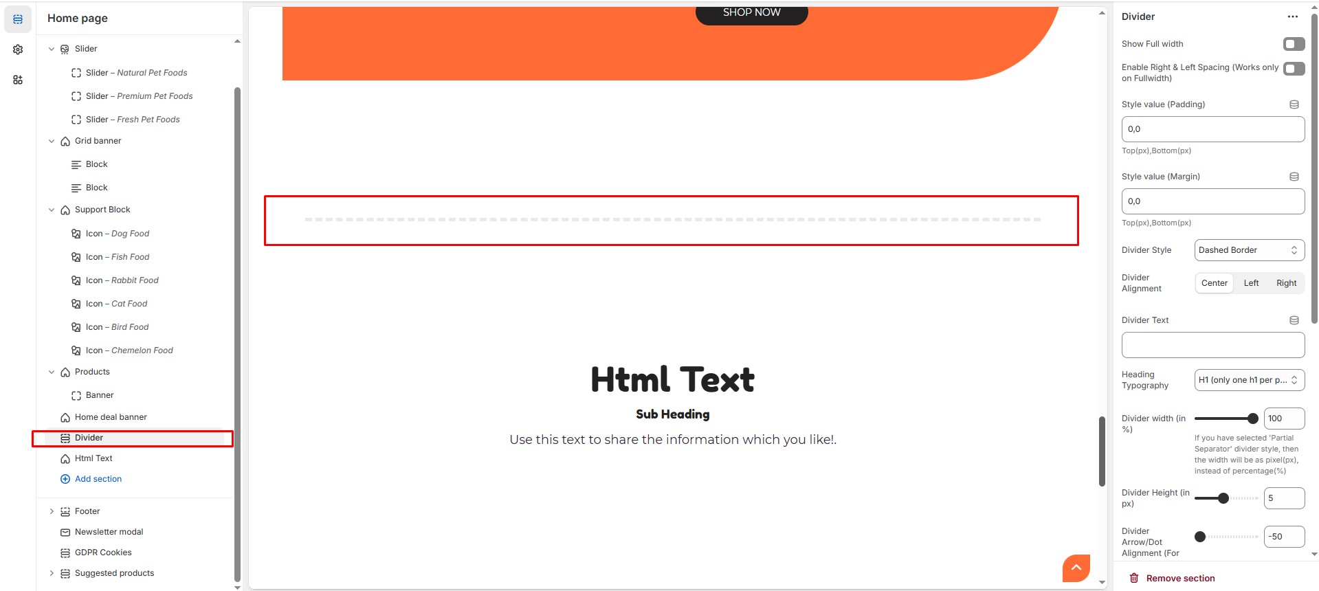
Show Full Width: Expands the section across the entire screen width.
Enable Right & Left Spacing (Works only on Fullwidth): Adds spacing on both sides (Works only in Full Width mode).
Style Value (Padding ) : Adjust the inner spacing above and below the section. Top(px), Bottom(px).
Style Value (Margin ) : Adjust the outer spacing above and below the section. Top(px), Bottom(px).
Divider style : Choose the divider style (Default, Dotted border, Dashed border, Double border, Shadow, Gradient, Bottom arrow, Center dot, Running lines, Partial separators).
Divider Alignment : Choose the divider alignment (Left, Center, Right).
Divider Text : Customize the divider text.
Heading Typography : Customize the heading typography (h1 to h6).
Divider Width (in %) : Customize the divider width (If you have selected 'Partial Separator' divider style, then the width will be as pixel(px), instead of percentage(%).
Divider Height (in px) : Customize the divide height.
Divider Arrow/Dot Alignment (For 'Bottom Arrow' & 'Center Dot' Styles) : Customize the range (-50 to 0 ) works only for the style bottom arrow or center dot.
Divider Bottom Alignment (Not for 'Partial Separator' Style) : Customize the range (-50 to 0 ).
Section Color settings
Heading color (Only for With Text Divider Style) : Customize the heading color (Set Your Preferred Color).
Divider Color : Customize the divider color (Set Your Preferred Color).
Additional Settings
Custom Class: The Shopify allows you to apply unique CSS styles to specific sections, blocks, or elements within your theme.