Featured Collection
The Featured Collection section in Shopify allows you to highlight a specific collection of products on your store’s homepage or other pages. This helps showcase popular, new, or seasonal items, making it easier for customers to browse curated selections.
Navigate to Shopify Admin > Online Store > Themes.
Click Customize on your active theme.
In the Theme Editor, click Add Section > Featured Collection
Create a product and assign the created collection in the customizer
Featured Collection Section & Customization Options
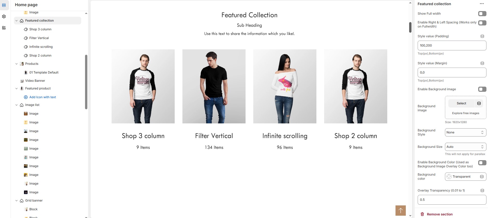
Show Full Width: Expands the featured collection section across the entire screen width.
Enable Right & Left Spacing (Works only on Fullwidth): Adds spacing on both sides (works only in Full Width mode).
Style Value (Padding ) : Adjust the inner spacing above and below the section. Top(px), Bottom(px).
Style Value (Margin ) : Adjust the outer spacing above and below the section. Top(px), Bottom(px).
Enable Background Image: Allows adding a background image for the section.
Background Image: Upload the image (Recommended size based on design requirements).
Background Style: Choose background style ( Fixed, Parallax, or None ).
Background Size: Choose background size ( Auto, Cover, Contain, Repeat).
Enable Background Color: Enable a background color (also used as an overlay color).
Overlay Transparency: Adjust the transparency of the overlay (value between 0.01 and 1).
Main Heading: Customize the Main heading.
Sub Heading: Add a short text to the content.
Description: Add text to share information about the collection.
Link Text: Customize the text for the clickable link.
Link URL: Paste a URL or search for an internal link.
Section Color Settings
Heading Color: Customize the heading color (Set Your Preferred Color).
Sub Heading Color: Customize the sub-heading color (Set Your Preferred Color).
Description Color: Customize the description text color (Set Your Preferred Color).
Button Background Color: Customize the button background color (Set Your Preferred Color).
Button Text Color: Customize the button text color (Set Your Preferred Color).
Button Hover Background Color: Customize the hover background color for buttons (Set Your Preferred Color).
Button Hover Text Color: Customize the hover text color for buttons (Set Your Preferred Color).
Heading position : Choose heading position( Left, Right, Center ).
Display Settings
Items per Row: Choose the number of items displayed per row (maximum 2 for list style). will not work if carousel is enabled.
Banner Style: Choose between ( Grid, List, or Overlay ).
Column Gap: Customizer spacing between columns.
Enable Equal Height: Ensures all items have equal height (Only for Grid Style).
Minimum Height (Overlay Style): Adjust the height.
Enable Box Shadow: Adds a shadow effect to the collection.
Collection Border Radius: The border corners can be rounded using the collection border-radius property. (Leave empty for default border radius).
List Style Content Width
Desktop: Defines how content and image are split (Eg., 50 / 50 ).
Laptop (Small Screen): Defines the layout for smaller screens.(Eg., 35 / 65 ). Mobile resolution defaults to 100/100
Carousel Settings
Enable Carousel: Activate the sliding effect for product display.
Enable Auto Height: Adjust height dynamically based on content.
Autoplay Timing: Customize the rotation timing (Use 0 to stop auto-rotate).
Slides per Row: Choose the number of slides per row.
Enable Carousel Pagination: Display pagination dots for navigation.
Carousel Pagination Alignment (Only bottom): Choose pagination alignment (Left Aligned, Center Aligned, Right Aligned).
Enable Navigation Arrows: Enable next/previous arrows for navigation.
Navigation Arrows Position: Choose navigation arrow position (Top left, Top center, Top bottom, Center, Bottom left, Bottom center, Bottom right).
Navigation Button Background Color: Customize the background color (Set Your Preferred Color).
Navigation Button Icon Color: Customize the icon color (Set Your Preferred Color).
Navigation Button Hover Background Color: Customize the hover background color (Set Your Preferred Color).
Navigation Button Hover Icon Color: Customize the hover icon color (Set Your Preferred Color).
Navigation Dot Color: Customize the color of navigation dots (Set Your Preferred Color).
Navigation Dot Active Color: Customize the active navigation dot color (Set Your Preferred Color).
Advanced Customization
Custom Class: The Shopify allows you to apply unique CSS styles to specific sections, blocks, or elements within your theme.
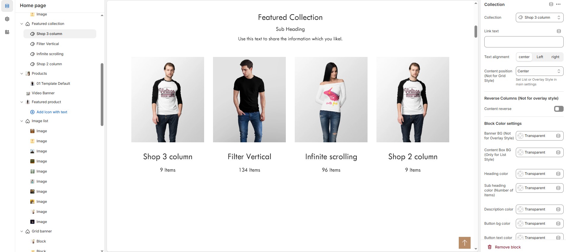
Add Collection Customization Options
Collection: Choose a collection assigned in backend (Product Creations) (creating collection).
Link text : Set the text of action clickable
Text Alignment : Choose text alignment (Left, Right, Center).
Content position: Choose the position (Top left, Top center, Top right, Center left, Center, Center right, Bottom left, Bottom center, Bottom right).
Reverse Columns : Swap the order of text and images (Not available for Overlay Style).
Block Color Settings
Banner Background (Not for Overlay Style) : Customize the banner background color (Set Your Preferred Color).
Content Box Background (Only for List Style) : Customize the content box background color (Set Your Preferred Color).
Heading Color : Customize the heading color (Set Your Preferred Color).
Subheading Color : Customize the sub heading color (Set Your Preferred Color).
Description Color : Customize the description color (Set Your Preferred Color).
Button Background Color : Customize the button background color (Set Your Preferred Color).
Button Text Color : Customize the button text color (Set Your Preferred Color).
Button Hover Background Color : Customize the button hover background color (Set Your Preferred Color).
Button Hover Text Color : Customize the button hover text color (Set Your Preferred Color).
Overlay Settings
Overlay Style : Choose overlay style (Normal overlay and Gradient overlay).
Overlay Color : Customize the overlay color (Set Your Preferred Color).
Overlay Opacity : Adjust the transparency of the overlay (value between 0.01 and 1).
Gradient Position : Customize the gradient angle (0 to 360) only for gradient overlay.