Products
The Products Section allows you to highlight your best-selling or featured products in a flexible and customizable layout. With options for carousel display, list view, and design customizations, you can tailor the section to match your store’s style and enhance the shopping experience.
Navigate to Shopify Admin > Online Store > Themes.
Click Customize on your active theme.
In the Theme Editor, click Add Section > Products
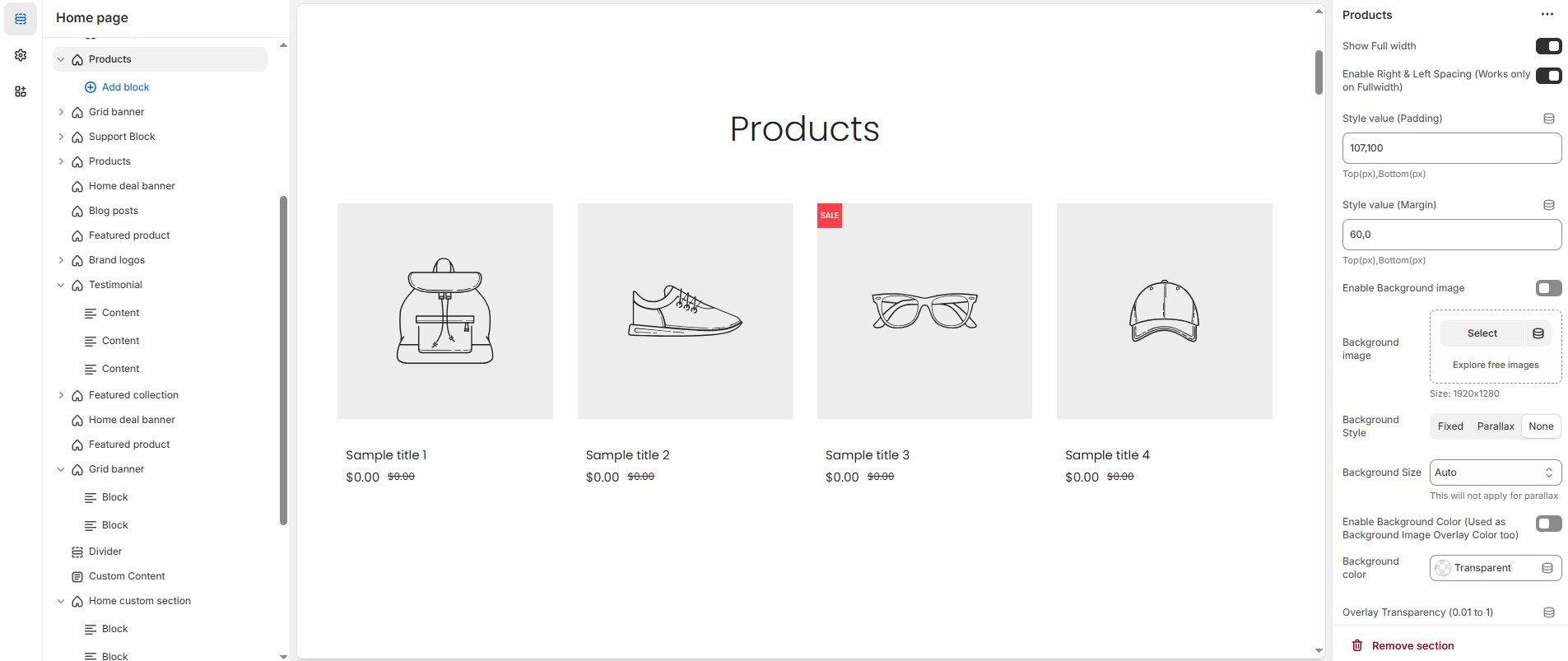
Products Section & Customization Options
Show Full Width: Expands the section across the entire screen width.
Enable Right & Left Spacing (Works only on Fullwidth): Adds spacing on both sides (Works only in Full Width mode).
Style Value (Padding ) : Adjust the inner spacing above and below the section. Top(px), Bottom(px).
Style Value (Margin ) : Adjust the outer spacing above and below the section. Top(px), Bottom(px).
Enable Background Image: Allows adding a background image for the section.
Background Image: Upload the image (Recommended size based on design requirements).
Background Style: Choose background style ( Fixed, Parallax, or None ).
Background Size: Choose background size ( Auto, Cover, Contain, Repeat).
Background Color : Customize the background color (Set Your Preferred Color).
Enable Overlay: Adds an overlay effect to the background.
Overlay Transparency: Adjust the transparency of the overlay (value between 0.01 and 1).
Main Heading: Customize the Main heading.
Sub Heading: Add a short text to the content.
Description: Add text to share information about the collection.
Link Text: Customize the text for the clickable link.
Link URL: Paste a URL or search for an internal link.
Section Color Settings
Heading Icon Color: Customize the heading icon color (Set Your Preferred Color).
Heading Color: Customize the main heading color (Set Your Preferred Color).
Sub Heading Color: Customize the sub-heading color (Set Your Preferred Color).
Description Color: Customize the description text color (Set Your Preferred Color).
Button Background Color: Customize the button background color (Set Your Preferred Color).
Button Text Color: Customize the button text color (Set Your Preferred Color).
Button Hover Background Color: Customize the hover background color of the button (Set Your Preferred Color).
Button Hover Text Color: Customize the button text color on hover (Set Your Preferred Color).
Heading Position: Choose the heading position (Center, Left, Right).
Grouped Content Settings
Grouped Content Background Color: Customize the grouped content background color (Set Your Preferred Color).
Grouped Content Column Gap: Customizer spacing between columns.
Grouped Content Overall Padding: Adjust spacing above and below the section.
Group Border Radius : The border corners can be rounded using the content border-radius property. (Leave empty for default border radius).
Enable Group Box Shadow: Add a shadow effect.
Content Reverse: Enable to swap the row order.
Grouped Content Width
Desktop : Defines how content and image are split (Eg., 30 / 70).
Laptop : Defines the layout for smaller screens (Eg., 35/ 65).
Mobile resolution defaults to 100/100.
Additional Content Settings (Add a block from top)
Additional content bg color : Customize the additional content background color (Set Your Preferred Color).
Additional content box shadow : Add a shadow effect.
Additional Content Overall Padding : Adjust spacing above and below the section.
Additional Content Border radius : The border corners can be rounded using the additional content border-radius property. (Leave empty for default border radius).
Main Content Settings
Enable Main content : display the main content.
Main content Bg color: Customize the main content background color (Set Your Preferred Color).
Main content Box shadow: Add a shadow effect.
Main content Radius: The border corners can be rounded using the main content border-radius property. (Leave empty for default border radius).
Main Content Overall Padding : Adjust spacing above and below the section.
Collection: Choose a product collection.
Collection Column Gap: Customizer spacing between columns.
Collection Border Radius: The border corners can be rounded using the collection border-radius property. (Leave empty for default border radius).
Enable List View: Display products in a list format (not compatible with carousel).
Items Per Row: Choose the number of items displayed per row.
Number of Products to Display: Customize the total number of products shown.
Enable Carousel: Activate a sliding product display.
Slides Per Row: Set different values for Desktop, Laptop, Tablet, and Mobile.
Number of Rows: Customize the number of rows.
Autoplay Timing: Define auto-slide timing (Use
0to disable autoplay).Enable Auto Height: Adjust height dynamically based on content.
Enable Carousel Pagination: Display pagination dots for navigation.
Pagination Alignment: Choose pagination alignment (Left Aligned, Center Aligned, Right Aligned).
Pagination Position: Choose pagination position ( Inside the element or outside the element ).
Enable Navigation Arrows: Enable next/previous arrows for navigation.
Navigation Arrow Position: Choose navigation arrow position (Top left, Top center, Top bottom, Center, Bottom left, Bottom center, Bottom right).
Center Navigation Alignment: Choose navigation arrow alignment (Along with container, Inside container and Outside container).
Navigation Button Background Color: Customize the background color for navigation (Set Your Preferred Color).
Navigation Button Icon Color: Customize the icon color for navigation (Set Your Preferred Color).
Navigation Button Hover Background Color: Customize the hover background color for navigation (Set Your Preferred Color).
Navigation Button Hover Icon Color: Customize the hover icon color for navigation (Set Your Preferred Color).
Navigation Dot Color: Customize the color of navigation dots (Set Your Preferred Color).
Navigation Dot Active Color: Customize the active navigation dot color (Set Your Preferred Color).
Additional Customizations
Custom Class: The Shopify allows you to apply unique CSS styles to specific sections, blocks, or elements within your theme.
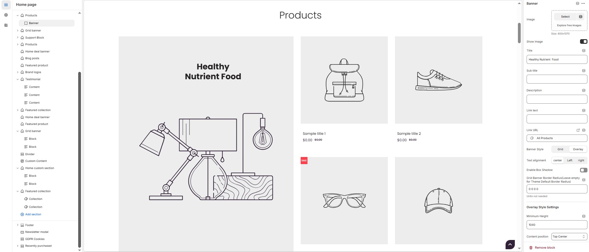
Products Section > Add Banner
The Banner feature allows you to highlight special promotions, discounts, or featured products with an image and customizable text elements.
Banner
Image: Upload the image (Recommended size based on design requirements).
Show Image: Allows adding a image for the section.
Title: Customize the title.
Subheading: Add a short text to the content.
Description: Add text to share information about the banner.
Link Text: Customize the text for the clickable link.
Link URL: Paste a URL or search for an internal link.
Banner Style: Choose the display style ( Grid or overlay ).
Text Alignment: Choose the text alignment ( Left, Center, or Right ).
Enable Box Shadow: Adds a shadow effect to banner.
Grid Banner Border Radius: The border corners can be rounded using the grid banner border-radius property. (Leave empty for default border radius).
Overlay Style Settings
Minimum Height: Adjust the height.
Content Position: Choose content position (Top left, Top center, Top right, Center left, Center, Center right, Bottom left, Bottom center, Bottom right).
Grid Banner Color Settings
Heading Color: Customize the heading color (Set Your Preferred Color).
Sub Heading Color: Customize the sub-heading color (Set Your Preferred Color).
Description Color: Customize the description text color (Set Your Preferred Color).
Button Background Color: Customize the button background color (Set Your Preferred Color).
Button Text Color: Customize the button text color (Set Your Preferred Color).
Button Hover Background Color: Customize the hover background color for buttons (Set Your Preferred Color).
Button Hover Text Color: Customize the hover text color for buttons (Set Your Preferred Color).
Background Color: Customize the background color (Set Your Preferred Color).
Image Overlay Style : Choose overlay style ( Normal Overlay or Gradient Overlay ).
Image Overlay Color : Customize the Overlay color (Set Your Preferred Color).
Image Overlay Opacity : Adjust the transparency of the overlay (value between 0.01 and 1).
Image Overlay Gradient Position (0 to 360) : Customizer the gradient position.
Menu
Title: Customize the title.
Choose the menu : Select the menu.
Color Settings
Block Heading Color: Customize the block heading color (Set Your Preferred Color).
Block Link Color: Customize the block link color (Set Your Preferred Color).
Block Link Hover Color : Customize the block link hover color (Set Your Preferred Color).
Product
Select product : Choose the product.
Collection
Title : Customize the title.
Select Collection: Select the collection.
Enable Box shadow: Add a shadow effect.
Collection Border Radius: The border corners can be rounded using the collection border-radius property (Leave empty for default border radius).
Collection Column Gap: Customizer spacing between columns.
Limit (Will not work if carousel is enabled) : Customize the collection limit (eg., 1 to 5).
Carousel Settings
Enable Carousel : Activate a sliding product display.
Slide per row [Desktop, Laptop, Tablet, Mobile] : Choose the number of items displayed per row.
Number of Rows : Customize the number of rows.
Autoplay timing : Define auto-slide timing (Use 0 to disable autoplay).
Enable Auto Height : Adjust height dynamically based on content.
Enable Carousel Pagination : Display pagination dots for navigation.
Carousel Pagination Alignment (Only Bottom) : Choose pagination alignment (Left Aligned, Center Aligned, Right Aligned).
Enable Navigation Arrows : Enable next/previous arrows for navigation.
Navigation Arrows position : Choose navigation arrow position (Top left, Top center, Top bottom, Center, Bottom left, Bottom center, Bottom right).
Navigation Button BG Color : Customize the background color for navigation (Set Your Preferred Color).
Navigation Button Icon Color : Customize the icon color for navigation (Set Your Preferred Color).
Navigation Button Hover BG Color : Customize the hover background color for navigation (Set Your Preferred Color).
Navigation Button Hover Icon Color : Customize the hover icon color for navigation (Set Your Preferred Color).
Navigation Dot Color : Customize the color of navigation dots (Set Your Preferred Color).
Navigation Dot Active Color : Customize the active navigation dot color (Set Your Preferred Color).
Timer
Deal end date : Specify an expiration date (Format: 25 JAN 2025).
Image : Upload the image (Recommended size based on design requirements).
Show Image : Toggle to display or hide the deal image.
Title : Customize the title.
Sub title : Add a short text to the content.
Description : Add text to share information about the collection.
Link Text : Customize the text for the clickable link.
Link URL : Paste a URL or search for an internal link.
Text alignment : Choose text alignment (Left, Center, Right).
Deal Color Settings
Banner Bg : Customize the banner background (Set Your Preferred Color)
Heading Color : Customize the heading color (Set Your Preferred Color).
Sub Heading Color : Customize the sub-heading color (Set Your Preferred Color).
Description Color : Customize the description text color (Set Your Preferred Color).
Button Bg Color : Customize the button background color (Set Your Preferred Color).
Button Text Color : Customize the button text color (Set Your Preferred Color).
Button Hover Bg Color : Customize the hover background color of the button (Set Your Preferred Color).
Button Hover Text Color : Customize the button text color on hover (Set Your Preferred Color).
Deals Section Bg Color : Customize the background color of the deal section (Set Your Preferred Color).
Deals Section Timer Bg color: Customize the deal section timer background color (Set Your Preferred Color).
Deals Section Timer Color: Customize the deal section timer color (Set Your Preferred Color).