Newsletter
The Newsletter section allows you to collect customer email addresses for updates, promotions, and exclusive content. You can customize the section’s layout, colors, and styles to match your store’s theme.
Go to Shopify Admin > Online Store > Themes.
Click Customize on your active theme.
In the Theme Editor, click Add Section > Newsletter.
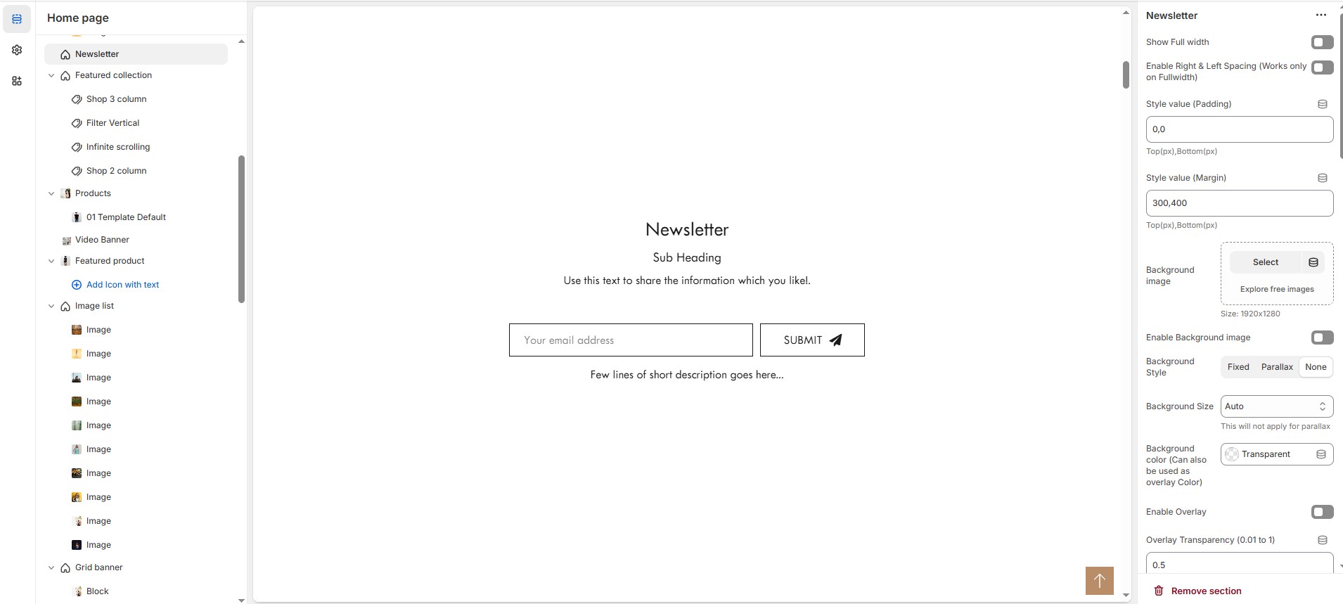
Newsletter Section Settings & Customization Options
Show Full Width: Expands the newsletter section across the entire screen width.
Enable Right & Left Spacing (Works only on Fullwidth): Adds spacing on both sides (Works only in Full Width mode).
Style Value (Padding ) : Adjust the inner spacing above and below the section. Top(px), Bottom(px).
Style Value (Margin ) : Adjust the outer spacing above and below the section. Top(px), Bottom(px).
Enable Background Image: Allows adding a background image for the section.
Upload Image: Upload the image (Recommended size based on design requirements).
Background Style: Choose background style ( Fixed, Parallax, or None ).
Background Size: Choose background size ( Auto, Cover, Contain, Repeat).
Background Color : Customize the background color (Set Your Preferred Color).
Enable Overlay: Adds an overlay effect to the background.
Overlay Transparency: Adjust the transparency of the overlay (value between 0.01 and 1).
Main Heading: Customize the Main heading.
Sub Heading: Add a short text to the content.
Description: Add text to share information about the collection.
Link Text: Customize the text for the clickable link.
Link URL: Paste a URL or search for an internal link.
Section Color Settings
Heading Color: Customize the heading color (Set Your Preferred Color).
Subheading Color: Customize the subheading color (Set Your Preferred Color).
Description Color: Customize the description text color (Set Your Preferred Color).
Button Background Color: Customize the button background color (Set Your Preferred Color).
Button Text Color: Customize the button text color (Set Your Preferred Color).
Button Hover Background Color: Customize the hover background color for buttons (Set Your Preferred Color).
Button Hover Text Color: Customize the hover text color for buttons (Set Your Preferred Color).
Heading Position : Choose Heading Position alignment (Left, Center, Right).
Form Settings
Content Position : Choose Content Position alignment (Left, Center, Right).
Form Width (in %) : Adjust the width (Adjustable as per design needs).
Newsletter Description: Customizer the Newsletter description.
Newsletter Style: Modify if multiple styles are available.
Swap Button Text & Icon Position: Enable the placement of text and icon.
Gap Between Text Box & Button (in px): Customizer spacing (Eg., 10px) (Not applicable for Style 3 & 4) .
Newsletter Color Settings
Box Border Color: Customize the border color (Set Your Preferred Color).
Box Background Color: Customize the background color (Set Your Preferred Color).
Box Border Color (On Focus/Active): Customize the active border color (Set Your Preferred Color).
Button Background Color (Leave empty for Style 4): Customize the button background color (Set Your Preferred Color).
Button Text Color: Customize the button text color (Set Your Preferred Color).
Button Hover Background Color (Leave empty for Style 4): Customize the hover background color (Set Your Preferred Color).
Button Hover Text Color: Customize the hover text color (Set Your Preferred Color).
Newsletter Description Color: Customize the description text color (Set Your Preferred Color).
Advanced Customization
Custom Class : The Shopify allows you to apply unique CSS styles to specific sections, blocks, or elements within your theme.