Home Marquee Section
The Marquee Section allows you to create a scrolling text or image effect, making it ideal for announcements, brand highlights, or promotional messages.
Go to Shopify Admin > Online Store > Themes.
Click Customize on your live theme.
In the theme editor, Click Add Section > Home Marque Section.
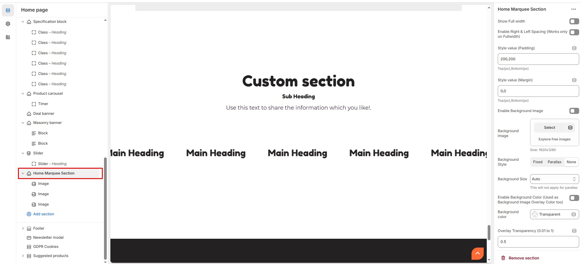
Show Full Width: Expands the marquee section across the entire screen width.
Enable Right & Left Spacing (Works only on Fullwidth): Adds spacing on both sides (works only in Full Width mode).
Padding (Top, Bottom): Adjust the inner spacing above and below the section. Top(px), Bottom(px).
Margin (Top, Bottom): Adjust the outer spacing above and below the section. Top(px), Bottom(px).
Enable Background Image: Allows adding a background image for the section.
Background Image: Upload the image (Recommended size based on design requirements).
Background Style: Choose background style ( Fixed, Parallax, or None ).
Background Size: Choose background size ( Auto, Cover, Contain, Repeat), This will not apply for parallax.
Enable Background Color: Enable a background color (also used as an overlay color).
Overlay Transparency: Adjust the transparency of the overlay (value between 0.01 and 1).
Main Heading: Customize the Main heading.
Sub Heading: Add a short text to the content.
Description: Add text to share information about the section.
Link Text: Customize the text for the clickable link.
Link URL: Paste a URL or search for an internal link.
Section Color Settings
Heading Color: Customize the heading color (Set Your Preferred Color).
Sub Heading Color: Customize the sub-heading color (Set Your Preferred Color).
Description Color: Customize the description text color (Set Your Preferred Color).
Button Background Color: Customize the button background color (Set Your Preferred Color).
Button Text Color: Customize the button text color (Set Your Preferred Color).
Button Hover Background Color: Customize the hover background color for button (Set Your Preferred Color).
Button Hover Text Color: Customize the hover text color for button (Set Your Preferred Color).
Heading position : Choose heading position( Left, Right, Center ).
Content Settings
Column Gap - Leave empty for Default Gap (Units not needed) : Customize spacing between columns.
Layout Style : Choose the layout style (Default, Boxed, With seperator).
Animation Speed : Choose the animation speed (Slow, Medium, Fast).
Enable Reverse Animation : Enable or disable reverse animation.
Block Background Color : Customize the block background color (Set Your Preferred Color).
Block Content color : Customize the block content color (Set Your Preferred Color).
Additional Settings
Custom Class: The Shopify allows you to apply unique CSS styles to specific sections, blocks, or elements within your theme.
Add Block Customization Options
Image
Main Heading : Customize the main heading
Block Image : Upload the image (Recommended size based on design requirements).
Link : Paste a URL or search for an internal link.
Class
Main Heading : Customize the main heading
Font Awesome Class : Customize the font awesome class.
Link : Paste a URL or search for an internal link.