Specification Block
The Specification Block section allows you to display key product or service features in a structured layout with customizable text, images, and design options.
Go to Shopify Admin > Online Store > Themes.
Click Customize on your active theme.
In the Theme Editor, click Add Section > Specification Block.
Specification Block Settings & Customization Options
Show Full Width: Expands the section across the entire screen width.
Enable Right & Left Spacing (Works only on Fullwidth): Adds spacing on both sides (Works only in Full Width mode).
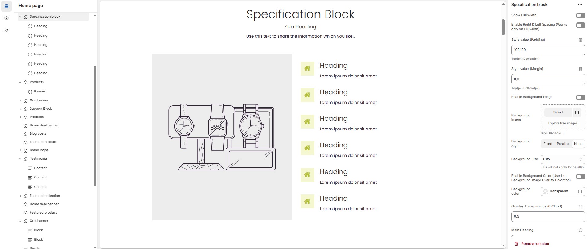
Padding (Top, Bottom): Adjust the inner spacing above and below the section. Top(px), Bottom(px).
Margin (Top, Bottom): Adjust the outer spacing above and below the section. Top(px), Bottom(px).
Enable Background Image: Allows adding a background image for the section.
Background Image: Upload the image (Recommended size based on design requirements).
Background Style: Choose background style ( Fixed, Parallax, or None ).
Background Size: Choose background size ( Auto, Cover, Contain, Repeat).
Background Color : Customize the background color (Set Your Preferred Color).
Enable Overlay: Adds an overlay effect to the background.
Overlay Transparency: Adjust the transparency of the overlay (value between 0.01 and 1).
Main Heading: Customize the Main heading.
Sub Heading: Add a short text to the content.
Description: Add text to share information about the collection.
Link Text: Customize the text for the clickable link.
Link URL: Paste a URL or search for an internal link.
Section Color Settings
Heading Color: Customize the main heading color (Set Your Preferred Color).
Sub Heading Color: Customize the sub-heading color (Set Your Preferred Color).
Description Color: Customize the description text color (Set Your Preferred Color).
Button Background Color: Customize the button background color (Set Your Preferred Color).
Button Text Color: Customize the button text color (Set Your Preferred Color).
Button Hover Background Color: Customize the hover background color of the button (Set Your Preferred Color).
Button Hover Text Color: Customize the button text color on hover (Set Your Preferred Color).
Display Settings
Column Gap: Customizer spacing between columns.
Vertical Position: Choose the vertical position ( Vertical top, Vertical center or Vertical bottom).
Column Width Settings
Desktop: Defines how content and image are split (Eg., 50 / 50).
Laptop: Defines how content and image are split (Eg., 40/ 60).
Tablet: Defines the layout for smaller screens(Eg., 35/ 65).
Main Block Settings
Enable Image: Allows adding a image for the section.
Image: Upload the image (Recommended size based on design requirements).
Title: Customize the main block title.
Sub Title: Add a short text to the content.
Description: Add text to share information about the section.
Link Text: Customize the text for the clickable link.
Link URL: Paste a URL or search for an internal link.
Banner Style: Choose the banner style (Grid or Overlay).
Text Alignment: Choose text alignment ( Center, Left, Right ).
Banner Content Position: Choose the banner content postion (Top left, Top center, Top bottom, Center left, Center, Center right, Bottom left, Bottom center, Bottom right).
Minimum Height (Overlay Style Only): Adjust the height.
Banner Border Radius: The border corners can be rounded using the banner border-radius property. (Leave empty for default border radius).
Enable Box Shadow: Add a shadow effect.
Overlay style : Choose overlay style ( Normal Overlay or Gradient Overlay ).
Overlay color : Customize the Overlay color (Set Your Preferred Color).
Overlay opacity : Adjust the transparency of the overlay (value between 0.01 and 1).
Gradient Position (0 to 360) : Customizer the gradient position.
Main Block Color Settings
Banner Bg : Customize the banner background color (Set Your Preferred Color).
Heading Color : Customize the heading color (Set Your Preferred Color).
Subheading Color : Customize the sub heading color (Set Your Preferred Color).
Description Color : Customize the description color (Set Your Preferred Color).
Button Background Color : Customize the button background color (Set Your Preferred Color).
Button Text Color : Customize the button text color (Set Your Preferred Color).
Button Hover Background Color : Customize the button hover background color (Set Your Preferred Color).
Button Hover Text Color : Customize the button hover text color (Set Your Preferred Color)
Additional Block Settings
Block Style: Modify if multiple styles are available.
Icon/Image Size: Customize the icon or image size (e.g., 24px).
Icon/Image Border Radius: The border corners can be rounded using the icon/image border-radius property. (Leave empty for default border radius).
Layout Style: Modify if multiple styles are available.
Settings for Block Style 1
Icon/Image Outer Size: Adjust the outer size of the icon/image (e.g., 50px).
Settings for Layout Style 3
Main Heading: Customize the main heading.
Subheading: Add a short text to the content.
Description: Add text to share information about the block.
Heading Position: Choose heading position ( Left, Center, Right ).
Block Color Settings
Icon Background Color: Customize the icon background color ( Set Your Preferred Color ).
Icon Color: Customize the icon color ( Set Your Preferred Color ).
Heading Color: Customize the heading text color ( Set Your Preferred Color ).
Description Color: Customize the description text color ( Set Your Preferred Color ).
Button Background Color: Customize the button background color ( Set Your Preferred Color ).
Button Text Color: Customize the button text color ( Set Your Preferred Color ).
Button Hover Background Color: Customize the button hover background color ( Set Your Preferred Color ).
Button Hover Text Color: Customize the button hover text color ( Set Your Preferred Color ).
Advanced Customization
Custom Class: The Shopify allows you to apply unique CSS styles to specific sections, blocks, or elements within your theme.
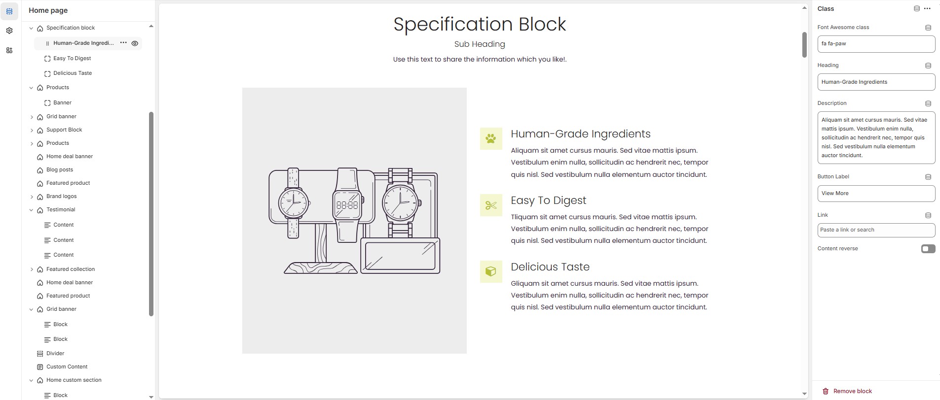
Steps to Add a Icon or Class
Class/Icon:On default the specification block add class, There are two types of block Class and Icon,The class allows to add font awesome class, The icon allows to add image or svg options.
Font awesome class: Customize the font awesome icon.
Heading: Customize the heading.
Description: Add text to share information about the section.
Button label: Customize the text for the clickable link.
Link: Paste a URL or search for an internal link.
Content Reverse: Enable to swap the row order of icon and text in specification block.