Brand Logos
The Brand Logos section allows you to showcase popular brand logos in a grid or carousel format. It enhances credibility and helps customers recognize trusted brands.
Navigate to Shopify Admin > Online Store > Themes.
Click Customize on your active theme.
In the Theme Editor, click Add Section > Brand Logos
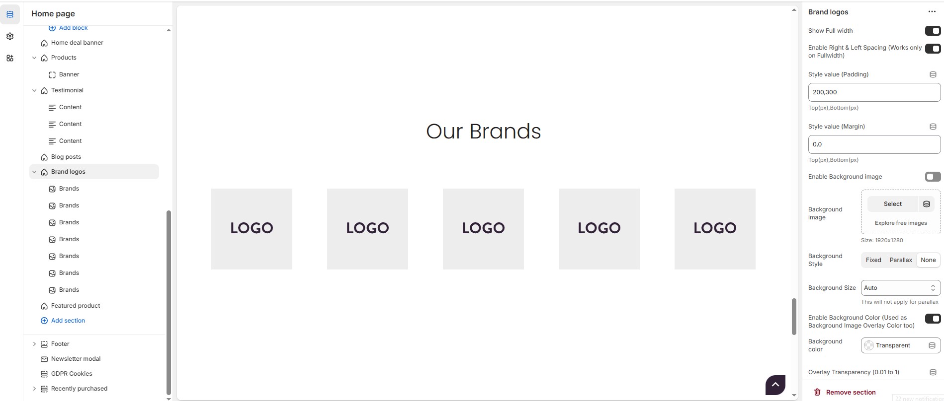
Brand Logos Settings & Customization Options
Show Full Width: Expands the section across the entire screen width.
Enable Right & Left Spacing (Works only on Fullwidth):Adds spacing on both sides (works only in Full Width mode).
Style Value (Padding ) : Adjust the inner spacing above and below the section. Top(px), Bottom(px).
Style Value (Margin ) : Adjust the outer spacing above and below the section. Top(px), Bottom(px).
Enable Background Image: Allows adding a background image for the section.
Background Image – Upload the image (Recommended size based on design requirements).
Background Style: Choose background style ( Fixed, Parallax, or None ).
Background Size: Choose background size ( Auto, Cover, Contain, Repeat).
Enable Background Color: Enable a background color (also used as an overlay color).
Background Color : Customize the background color (Set Your Preferred Color).
Overlay Transparency: Adjust the transparency of the overlay (value between 0.01 and 1).
Main Heading: Customize the Main heading.
Sub Heading: Add a short text to the content.
Description: Add text to share information about the collection.
Link Text: Customize the text for the clickable link.
Link URL: Paste a URL or search for an internal link.
Section Color Settings
Heading Color: Customize the heading color (Set Your Preferred Color).
Sub Heading Color: Customize the sub-heading color (Set Your Preferred Color).
Description Color: Customize the description text color (Set Your Preferred Color).
Button Background Color: Customize the button background color (Set Your Preferred Color).
Button Text Color: Customize the button text color (Set Your Preferred Color).
Button Hover Background Color: Customize the hover background color for buttons (Set Your Preferred Color).
Button Hover Text Color: Customize the hover text color for buttons (Set Your Preferred Color).
Heading position : Choose heading position( Left, Right, Center ).
Block & Grid Settings
Items per Row: Choose the number of items displayed per row (1 to 6) ,This will not work, if carousel enabled) .
Block Style: Modify the design if multiple styles are available. Choose the block style (Style 1, Style 2, Style 3).
Enable Box Shadow: Adds a shadow effect to the banner.
Column Gap: Customizer spacing between columns.
Border Radius: The border corners can be rounded using the block border-radius property. (Leave empty for default border radius).
Block Border Color: Customize the block border color (Set Your Preferred Color).
Block Background Color: Customize the block background color (Set Your Preferred Color).
Carousel Settings (Optional)
Enable Carousel: Activate sliding effect for brand logos.
Enable Auto Height: Adjust height dynamically based on content.
Slides per Row: Set different values for Desktop, Laptop, Tablet, and Mobile.
Autoplay Timing: Adjust rotation speed (Use 0 to disable autoplay).
Enable Carousel Pagination: Display pagination dots for navigation.
Carousel Pagination Alignment: Choose pagination alignment (Left Aligned, Center Aligned, Right Aligned).
Enable Navigation Arrows: Enable next/previous arrows for navigation.
Navigation Arrow Position: Choose navigation arrow position (Top left, Top center, Top bottom, Center, Bottom left, Bottom center, Bottom right).
Center navigation alignment (Select 'Center', in the above dropdown) : Choose the center navigation alignment (Outside container, Along with container, Inside container ).
Navigation Button Background Color: Customize the background color (Set Your Preferred Color).
Navigation Button Icon Color: Customize the icon color (Set Your Preferred Color).
Navigation Button Hover Background Color: Customize the hover background color (Set Your Preferred Color).
Navigation Button Hover Icon Color: Customize the hover icon color (Set Your Preferred Color).
Navigation Dot Color: Customize the color of navigation dots (Set Your Preferred Color).
Navigation Dot Active Color: Customize the active navigation dot color (Set Your Preferred Color).
Enable After Image: Option to display an additional image after the main brand logos.
After Image : Upload the image (Recommended size based on design requirements).
Additional Customizations
Custom Class: The Shopify allows you to apply unique CSS styles to specific sections, blocks, or elements within your theme.
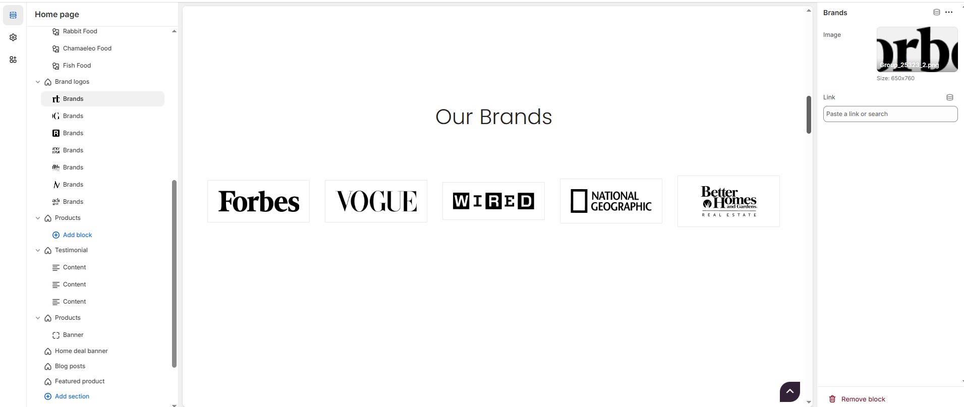
Steps to Add a Brand Logo
Without adding block to Brand logo the section seems to be empty
Image : Upload the image (Recommended size based on design requirements).
Link : Add a destination URL (optional) to direct users to the brand's page.