Testimonial
The Testimonial Section allows you to showcase customer feedback in an engaging and structured format. This section includes images, quotes, author details, and multiple styling options to enhance credibility and trust.
Go to Shopify Admin > Online Store > Themes.
Click Customize on your active theme.
In the Theme Editor, click Add Section > Testimonial.
Testimonial Section Settings & Customization Options
Show Full Width: Expands the section across the entire screen width.
Enable Right & Left Spacing (Works only on Fullwidth): Adds spacing on both sides (Works only in Full Width mode).
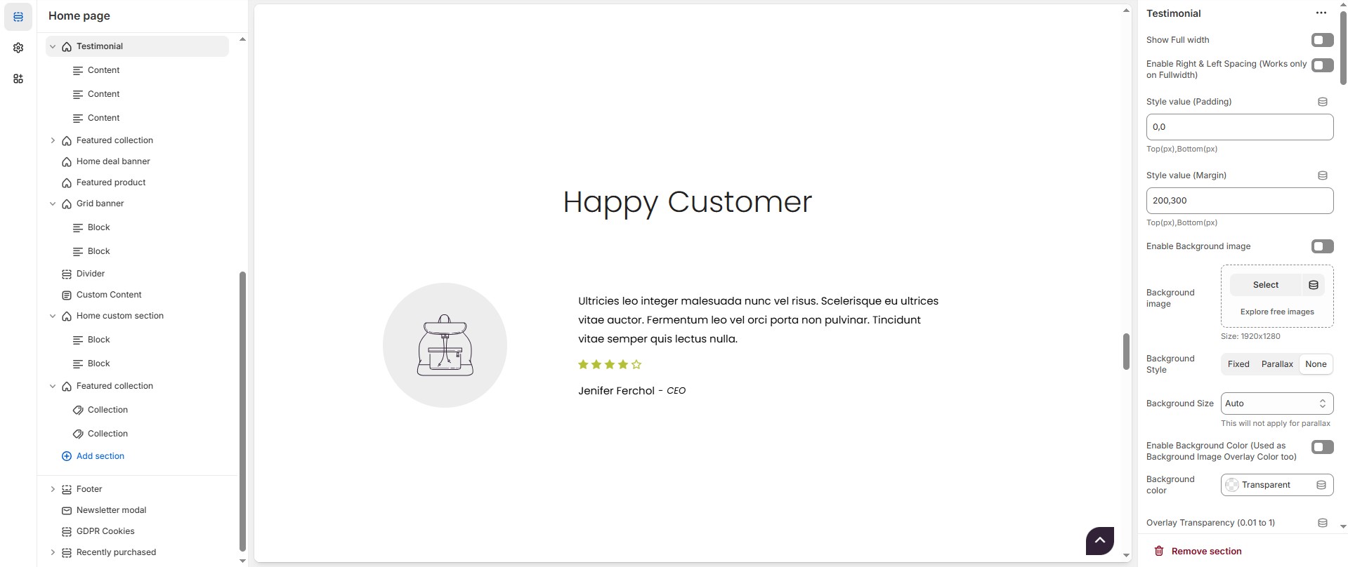
Padding (Top, Bottom): Adjust the inner spacing above and below the section. Top(px), Bottom(px).
Margin (Top, Bottom): Adjust the outer spacing above and below the section. Top(px), Bottom(px).
Enable Background Image: Allows adding a background image for the section.
Background Image: Upload the image (Recommended size based on design requirements).
Background Style: Choose background style ( Fixed, Parallax, or None ).
Background Size: Choose background size ( Auto, Cover, Contain, Repeat).
Enable Background Color(Used as Background Image Overlay Color too) : Allows adding a background color for the sections on enable.
Background Color : Customize the background color (Set Your Preferred Color).
Overlay Transparency: Adjust the transparency of the overlay (value between 0.01 and 1).
Main Heading: Customize the Main heading.
Sub Heading: Add a short text to the content.
Description: Add text to share information about the collection.
Link Text: Customize the text for the clickable link.
Link URL: Paste a URL or search for an internal link.
Section Color Settings
Heading Color: Customize the heading color (Set Your Preferred Color).
Subheading Color: Customize the subheading color (Set Your Preferred Color).
Description Color: Customize the description text color (Set Your Preferred Color).
Button Background Color: Customize the button background color (Set Your Preferred Color).
Button Text Color: Customize the button text color (Set Your Preferred Color).
Button Hover Background Color: Customize the hover background color for buttons (Set Your Preferred Color).
Button Hover Text Color: Customize the hover text color for buttons (Set Your Preferred Color).
Heading Position : Choose Heading Position alignment (Left, Center, Right).
Testimonial Settings
Items per Row: Choose the number of items displayed per row.
Testimonial Style: Modify if multiple styles are available.( Style1, Style2, Style3 )
Testimonial Boxed Styles: Choose testimonial boxed style ( Defalut (plain) , Overall boxed, content boxed or Quote boxed).
Enable Box Shadow: Adds a shadow effect to testimonial boxes.
Content Reverse: Option to reverse the order of content elements.
Testimonial Text Alignment: Choose text alignment (Left, Center, Right).
Quote Icon: Upload a custom quote icon (Recommended size based on design requirements).
Quote Position: Adjust quote icon with placement options ( Within image, Within content and No Quote).
Side Image: Allows adding a After image.
After Image: Upload the image (Recommended size based on design requirements).
Author Info Style: Choose author info style ( Inline and Block).
Author image Radius (in px) - Set 50% for Rounded Image:The border corners can be rounded using the author image border-radius property. (Leave empty for default border radius).
Content Border Radius: The border corners can be rounded using the contentborder-radius property. (Leave empty for default border radius).
Column Gap: Customizer spacing between columns.
Style 1 Settings
Content Width - Desktop: Defines how content and image are split (Eg., 30 / 70 ).
Content Width - Laptop (Small Screen) & Tablet : Defines the layout for smaller screens.(Eg., 20 / 80 ).
Vertical Positioning: Choose Vertical position (Top, Center, Bottom).
Testimonial Color Settings
Border Color: Customize the border color (Set Your Preferred Color).
Background Color: Customize the background color (Set Your Preferred Color).
Content Color: Customize the content color (Set Your Preferred Color).
Review Stars Color: Customize the review star color (Set Your Preferred Color).
Author Text Color: Customize the author text color (Set Your Preferred Color).
Author Designation Color: Customize the author designation color (Set Your Preferred Color) .
Author Separator Color: Customize the author separator color (Set Your Preferred Color).
Quote Icon Color: Customize the quote icon color (Set Your Preferred Color).
Carousel Settings (Optional)
Enable Carousel: Activate sliding effect for testimonials.
Enable Auto Height: Adjust height dynamically based on content.
Slides per Row: Set different values for Desktop, Laptop, Tablet, and Mobile.
Autoplay Timing: Adjust rotation speed (Use 0 to disable autoplay).
Enable Carousel Pagination: Display pagination dots for navigation.
Carousel Pagination Alignment (Only Bottom): Choose pagination alignment (Left Aligned, Center Aligned, Right Aligned).
Carousel Pagination Bottom Alignment (Inside/Outside the Element): Choose pagination dot alignments (Inside the element, Outside the element).
Enable Navigation Arrows: Enable previous/next arrows for navigation.
Navigation Arrow Position: Choose navigation arrow position (Top left, Top center, Top bottom, Center, Bottom left, Bottom center, Bottom right).
Navigation Arrows Alignment: Choose navigation arrow position (Along with container, Inside container and Outside container).
Navigation Button Bg Color: Customize the background color for navigation (Set Your Preferred Color).
Navigation Button Icon Color: Customize the icon color for navigation (Set Your Preferred Color).
Navigation Button Hover Bg Color: Customize the hover background color for navigation (Set Your Preferred Color).
Navigation Button Hover Icon Color: Customize the hover icon color for navigation (Set Your Preferred Color).
Navigation Dot Color: Customize the color of navigation dots (Set Your Preferred Color).
Navigation Dot Active Color: Customize the active navigation dot color (Set Your Preferred Color).
Additional Customizations
Custom Class: The Shopify allows you to apply unique CSS styles to specific sections, blocks, or elements within your theme.
Testimonial Block Content Settings
Add Content: On default the block is added while adding testimonial section.If needed the block can be Delete using Delete icon and Hide using Eye icon and can also add using Add content.
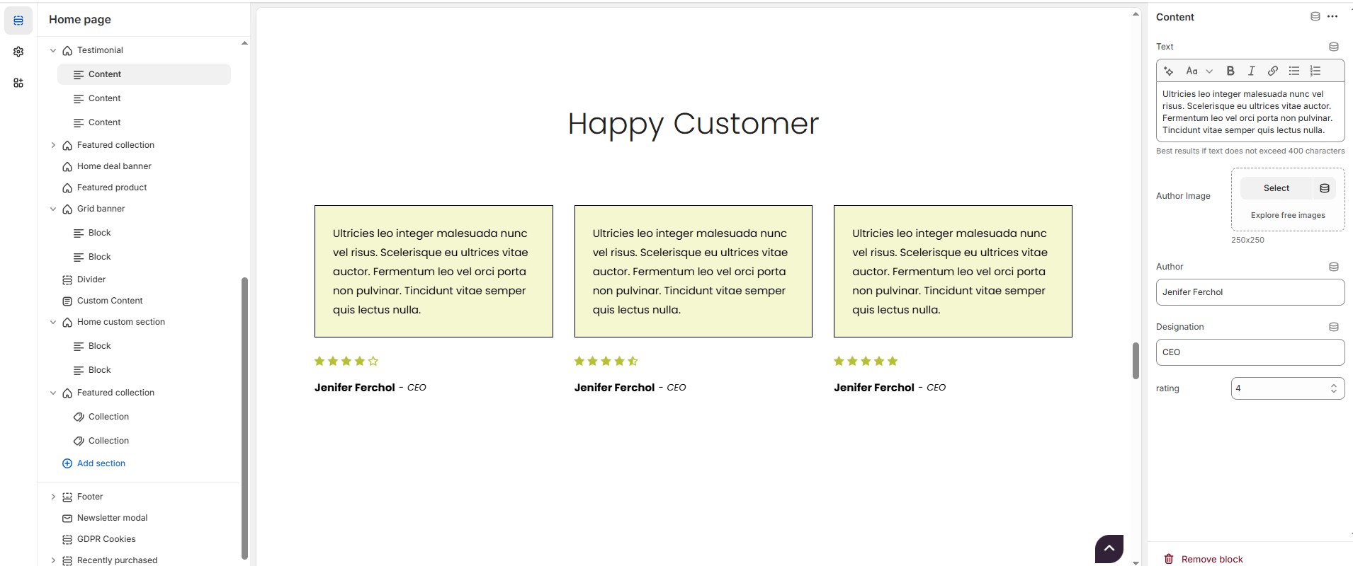
Text : Add customer feedback (Max: 400 characters) for best readability.
Author Image: Upload a profile image (Recommended size based on design requirements).
Author Name: Customize the Author name.
Designation: Customize the Job title.
Rating: Customize the rating to the content from 1 to 5.