Number counter
The Number Counter Section allows you to showcase animated statistics, milestones, or achievements, making it ideal for displaying company growth, customer success metrics, or key performance figures.
Go to Shopify Admin > Online Store > Themes.
Click Customize on your active theme.
In the Theme Editor, click Add Section > Number Counter.
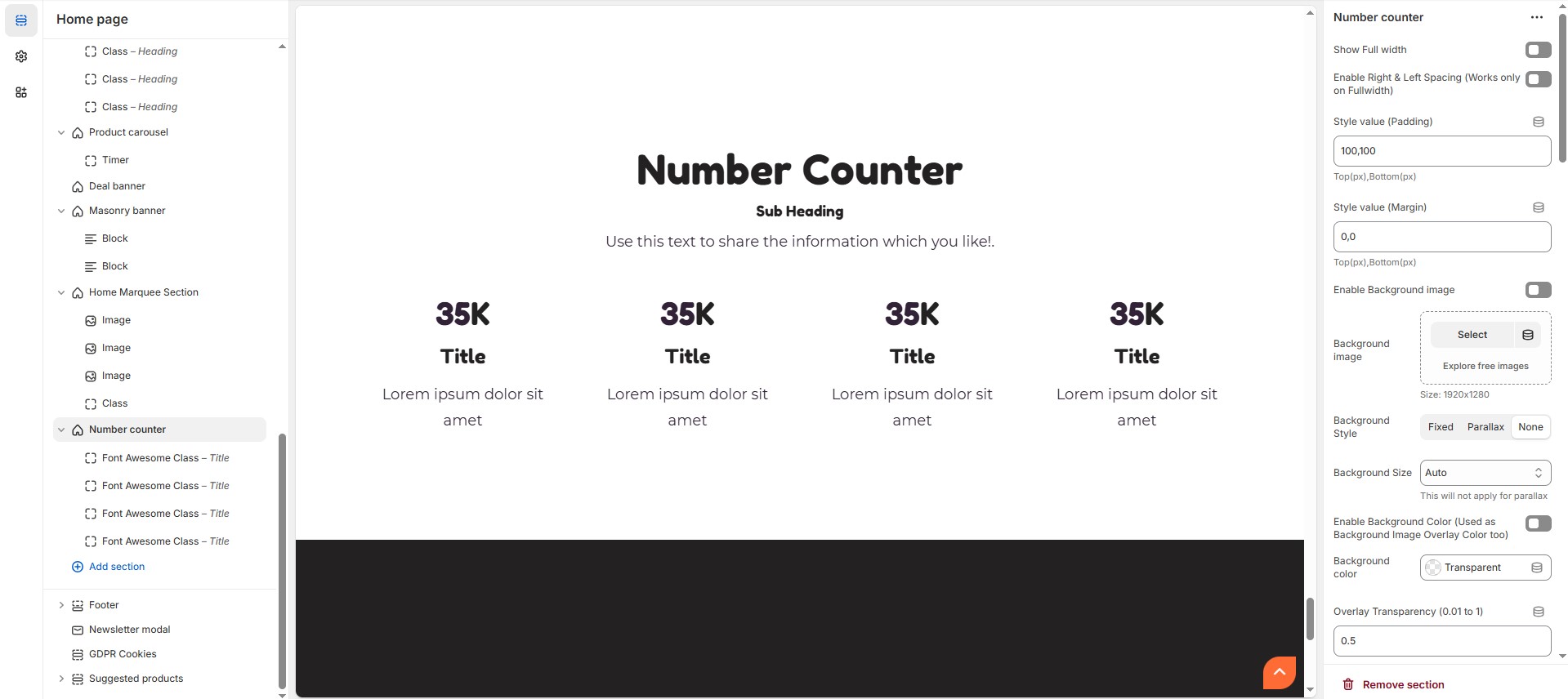
Number Counter Customizer Option
Show Full Width: Expands the section across the entire screen width.
Enable Right & Left Spacing (Works only on Fullwidth): Adds spacing on both sides (Works only in Full Width mode).
Style Value (Padding ) : Adjust the inner spacing above and below the section. Top(px), Bottom(px).
Style Value (Margin ) : Adjust the outer spacing above and below the section. Top(px), Bottom(px).
Enable Background Image: Allows adding a background image for the section.
Background Image: Upload the image (Recommended size based on design requirements).
Background Style: Choose background style ( Fixed, Parallax, or None ).
Background Size: Choose background size ( Auto, Cover, Contain, Repeat).
Enable Background Color: Enable a background color (also used as an overlay color).
Background Color : Customize the background color (Set Your Preferred Color).
Enable Overlay: Adds an overlay effect to the background.
Overlay Transparency: Adjust the transparency of the overlay value (between 0.01 and 1).
Main Heading: Customize the Main heading.
Sub Heading: Add a short text to the content.
Description: Add text to share information about the section.
Link Text: Customize the text for the clickable link.
Link URL: Paste a URL or search for an internal link.
Section Color Settings
Heading Color: Customize the main heading color (Set Your Preferred Color).
Sub Heading Color: Customize the sub-heading color (Set Your Preferred Color).
Description Color: Customize the description text color (Set Your Preferred Color).
Button Background Color: Customize the button background color (Set Your Preferred Color).
Button Text Color: Customize the button text color (Set Your Preferred Color).
Button Hover Background Color: Customize the hover background color of the button (Set Your Preferred Color).
Button Hover Text Color: Customize the button text color on hover (Set Your Preferred Color).
Heading Position : Choose heading position ( Center, Left, Right ).
Block Settings
Items per Row: Choose the number of items displayed per row .
Column Gap: Customize spacing between columns. (Leave empty for default border radius).
Counter Style : Choose the counter style (Grid and List).
Content Position (Only for list style) : Choose the content position (Vertical top, Vertical center, Vertical bottom).
Text alignment : Choose the text alignment (Center, Left, Right).
Reverse Columns
Content reverse : Enable or disable the content reverse.
Enable boxed style : Enable or disable the boxed style.
Enable Overall Border (Boxed Style will not work, if this is enabled) : Enable or disable overall border.
Overall Radius (Units not needed) : The border corners can be rounded using the overall border-radius property. (Leave empty for default border radius).
Icon Radius (in px) - Set 50% for Rounded Icon : Customize icon corner radius.
Icon/Image Outer Size (Units not needed) : Customize the size for the outer icon/image layer.
Icon/Image Size (Units not needed) : Customize the inner size of icon / image note that the inner size should be small than outer icon/image layer.
Enable Box Shadow : Adds a shadow effect to section.
Block Color settings
Block BG color (Enable boxed style or Overall Border Checkbox above) : Customize the block background color (Set Your Preferred Color).
Icon Border Color : Customize the icon border color (Set Your Preferred Color).
Icon BG color : Customize the icon background color (Set Your Preferred Color).
Icon color : Customize the icon color (Set Your Preferred Color).
Heading color : Customize the heading color (Set Your Preferred Color).
Description color : Customize the description color (Set Your Preferred Color).
Value color : Customize the value color (Set Your Preferred Color).
Value text Color (Suffixes like K, %) : Customize the value text color (Set Your Preferred Color).
Overall Border Color : Customize the overall border color (Set Your Preferred Color).
Advanced Customization
Custom Class: The Shopify allows you to apply unique CSS styles to specific sections, blocks, or elements within your theme.
Add Block Customization Options
Image
Icon : Upload the image (Recommended size based on design requirements).
Title : Customize the heading.
Text : Add text to share information about the section.
Value: Customize the number for the value.
Value text : Customize the value text.
Font Awesome Class
Font awesome class: Customize the font awesome icon.
Title : Customize the heading.
Text : Add text to share information about the section.
Value: Customize the number for the value.
Value text : Customize the value text.