Slider
The Slideshow Section allows you to display multiple images or banners in a rotating format, making it ideal for highlighting promotions, featured products, or key brand messages.
Go to Shopify Admin > Online Store > Themes.
Click Customize on your live theme.
In the theme editor, Click Add Section > Slider.
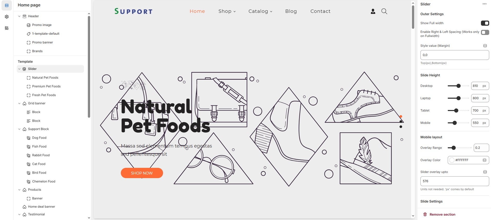
Outer Settings
Show Full Width: Expands the slider across the entire screen width.
Enable Right & Left Spacing (Works only on Fullwidth): Adds spacing on both sides (Works only in Full Width mode).
Style Value (Margin ) : Adjust the outer spacing above and below the section. Top(px), Bottom(px).
Slide Height (Responsive Settings): Customize height based on device
Recommended Slide Heights: Desktop – 810px | Laptop – 800px | Tablet – 700px | Mobile – 550px (You can set the responsive size as per your needs.)
Mobile Layout Settings
Overlay Range: Adjust the transparency of the overlay (value between
0.01and1).Overlay Color: Customize the overlay color (Set Your Preferred Color).
Slider Overlay Up To: Customize slider overly as per your requirements (Defult:
576pxApplies overlay up to this width).
Slide Settings
Content Within Container: Ensures the content stays inside a container for better alignment.
Overall Border Radius: The border corners can be rounded using the Overall border-radius property. (Leave empty for default border radius).
Content Border Radius: The border corners can be rounded using the Content border-radius property. (Leave empty for default border radius). unit not needed.
Enable Autoplay Slides: Enables automatic slide rotation.
Change Slides Every: Choose slides seconds (5sec, 6sec, 7sec, 8sec, 9sec and 10 sec). Enable autoplay slider before selecting.
Pagination & Navigation
Enable Pagination Dots: Enable pagination dots for slide transitions.
Carousel Pagination Dots Alignment (Only Bottom): Choose pagination alignments (Right alignment, Left alignment, Center alignment).
Carousel Pagination Dots Bottom Alignment: Choose pagination dot alignments (Inside the element, Outside the element).
Enable Navigation Arrows: Enable previous/next arrows for navigation.
Navigation Arrows Position: Choose navigation arrow position (Top left, Top center, Top bottom, Center, Bottom left, Bottom center, Bottom right).
Navigation Arrows Inside Container: Choose navigation arrow position (Along with container, Inside container and Outside container).
Navigation Dots & Arrows Color Settings
Navigation Arrow Background Color: Customize the background color for navigation arrows (Set Your Preferred Color).
Navigation Arrow Icon Color: Customize the icon color for navigation arrows (Set Your Preferred Color).
Navigation Arrow Hover Background Color: Customize the hover background color for navigation arrows (Set Your Preferred Color).
Navigation Arrow Hover Icon Color: Customize the hover icon color for navigation arrows (Set Your Preferred Color).
Navigation Dot Color: Customize the color of navigation dots (Set Your Preferred Color).
Navigation Dot Active Color: Customize the active navigation dot color (Set Your Preferred Color).
Image Settings
Enable Image: Allows adding a bottom image.
Bottom Image: Upload the image (Recommended size based on design requirements).
Advanced Customization
Custom Class: The Shopify allows you to apply unique CSS styles to specific sections, blocks, or elements within your theme.
Adding a block will display the image and content. Without the block, the slideshow remains empty.Can also remove and add block as per the theme requirement.
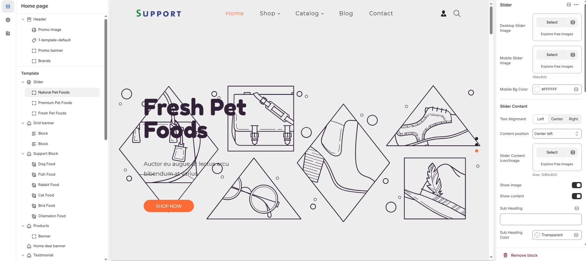
Desktop slider image : Upload the main slideshow image to view in desktop.
Mobile slider image : Upload a that to be view in mobile version.
Mobile Bg color: Customize the mobile background color (Set Your Preferred Color).
Slider Content
Text Alignment : Choose text alignment (Left, Right, Center).
Content position: Choose the position (Top left, Top center, Top right, Center left, Center, Center right, Bottom left, Bottom center, Bottom right).
Slider content icon / image: Upload the custom image (Recommended size based on design requirements).
Show image : Displays an image as the slider content image.
Show content : Displays an content as the slider content.
Sub heading : Add a short text to the content.
Sub heading color : Customize the sub heading color (Set Your Preferred Color).
Sub heading text size : Customizer the Sub heading font size.
Heading : Adding title to the content on slideshow block.
Heading color : Customize the heading color (Set Your Preferred Color).
Heading font size : Customizer the heading font size.
Description : Add a description or supporting text.
Description color : Customize the description color (Set Your Preferred Color).
Description text size : Customizer the description font size.
Slider button : Set the text of action clickable
Slider link : Add a destination URL.
Button bg color : Customize the button background color (Set Your Preferred Color).
Button text color : Customize the button text color (Set Your Preferred Color).
Button hover bg color : Customize the button hover background color (Set Your Preferred Color).
Button hover text color : Customize the button hover text color (Set Your Preferred Color).
Slider button 2 : Set the text of action clickable
Slider 2 link : Add a destination URL.
Button 2 bg color : Customize the button background color (Set Your Preferred Color).
Button 2 text color : Customize the button text color (Set Your Preferred Color).
Button 2 hover bg color : Customize the button hover background color (Set Your Preferred Color).
Button 2 hover text color : Customize the button hover text color (Set Your Preferred Color).
Slide Content Bg Color : Customize the slider content background color (Set Your Preferred Color).