Video Banner
The Video Banner section in Shopify allows you to add an engaging video background or popup video to enhance your store’s visual appeal. This feature is great for promotional content, brand storytelling, or product showcases.
Go to Shopify Admin > Online Store > Themes.
Click Customize on your active theme.
In the Theme Editor, click Add Section > Video Banner.
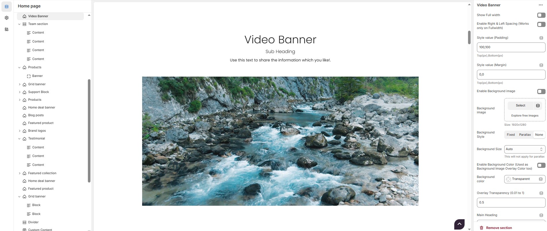
Video Banner Section Settings & Customization Options:
Show Full Width: Expands the section across the entire screen width.
Enable Right & Left Spacing(Workd only on Fullwidth): Adds spacing on both sides (Works only in Full Width mode).
Padding (Top, Bottom): Adjust the inner spacing above and below the section. Top(px), Bottom(px).
Margin (Top, Bottom): Adjust the outer spacing above and below the section. Top(px), Bottom(px).
Enable Background Image: Allows adding a background image for the section.
Background Image: Upload the image (Recommended size based on design requirements).
Background Style: Choose background style ( Fixed, Parallax, or None ).
Background Size: Choose background size ( Auto, Cover, Contain, Repeat).
Enable Background Color:Allows to enable the background color.
Background Color : Customize the background color (Set Your Preferred Color).
Enable Overlay: Adds an overlay effect to the background.
Overlay Transparency: Adjust the transparency of the overlay (value between 0.01 and 1).
Main Heading: Customize the Main heading.
Sub Heading: Add a short text to the content.
Description: Add text to share information about the section.
Link Text: Customize the text for the clickable link.
Link URL: Paste a URL or search for an internal link.
Section Color Settings
Heading Color: Customize the main heading color (Set Your Preferred Color).
Sub Heading Color: Customize the sub-heading color (Set Your Preferred Color).
Description Color: Customize the description text color (Set Your Preferred Color).
Button Background Color: Customize the button background color (Set Your Preferred Color).
Button Text Color: Customize the button text color (Set Your Preferred Color).
Button Hover Background Color: Customize the hover background color of the button (Set Your Preferred Color).
Button Hover Text Color: Customize the button text color on hover (Set Your Preferred Color).
Heading Position : Choose heading position ( Center, Left, Right ).
Video Banner - Content Settings
Title: Customize the video banner title.
Sub Title: Add a short text to the conten
Description: Add text to share information about the section.
Link Text: Customize the text for the clickable link.
Link URL: Paste a URL or search for an internal link.
Content Position: Choose the content position (Top left, Top center, Top bottom, Center left, Center, Center right, Bottom left, Bottom center, Bottom right).
Text Alignment: Choose text alignment ( Center, Left, Right ).
Video Banner - Media Settings
Layout Style: Choose layout style (Full width or Two column).
Content Reverse: Reverse the content order if required.
Poster Image: Upload the image
Show Image: Enable/disable the display of the image.
Video Format: Choose the video format ( Self hosted video, External video or popup).
Video Icon: Upload the icon.
Self-Hosted Video URL: Add the video file URL (e.g.,
https://storage.googleapis.com/coverr-main/mp4/Palm_Trees.mp4).Iframe Code (For External Video & Popup): Embed a video from YouTube, Vimeo, etc. (e.g.,
https://www.youtube.com/embed/JJMPKgyCoSY).Video Height: Adjust the video height.
Overlay Style: Choose the overlay style (With defalut overlay or with mask overlay ).
Mask Image: Upload the image (Recommended size based on design requirements).
Enable Box Shadow: Adds a shadow effect to the video.
Collection Border Radius: The border corners can be rounded using the collection border-radius property. (Leave empty for default border radius).
Video Banner Color Settings
Heading Color: Customize the heading color ( Set Your Preferred Color ).
Subheading Color: Customize the subheading color ( Set Your Preferred Color ).
Description Color: Customize the description text color ( Set Your Preferred Color ).
Button Background Color: Customize the button background color ( Set Your Preferred Color ).
Button Text Color: Customize the button text color ( Set Your Preferred Color ).
Button Hover Background Color: Customize the button hover background color ( Set Your Preferred Color ).
Button Hover Text Color: Customize the button text color on hover ( Set Your Preferred Color ).
Video Overlay Color: Customize the video overlay color ( Set Your Preferred Color ).
Video Overlay Transparency: Adjust the transparency of the overlay (value between 0.01 and 1).
Icon Color Settings (For Popup Video Format)
Icon Background Color: Customize the background color of the play button ( Set Your Preferred Color ).
Icon Color: Customize the color of the play icon ( Set Your Preferred Color ).
Icon Background Hover Color: Customize the icon color for the play button on hover ( Set Your Preferred Color ).
Icon Hover Color: Customize the icon color on hover ( Set Your Preferred Color ).
Advanced Customization
Custom Class: The Shopify allows you to apply unique CSS styles to specific sections, blocks, or elements within your theme.