Header Section
The Header Section is a key part of your Shopify store, appearing at the top of every page. It contains your logo, navigation menu, search bar, shopping cart icon, and additional links.

Go to Shopify Admin > Online Store > Themes.
Click Customize on your active theme.
Navigate to the Header Section in the Theme Editor.
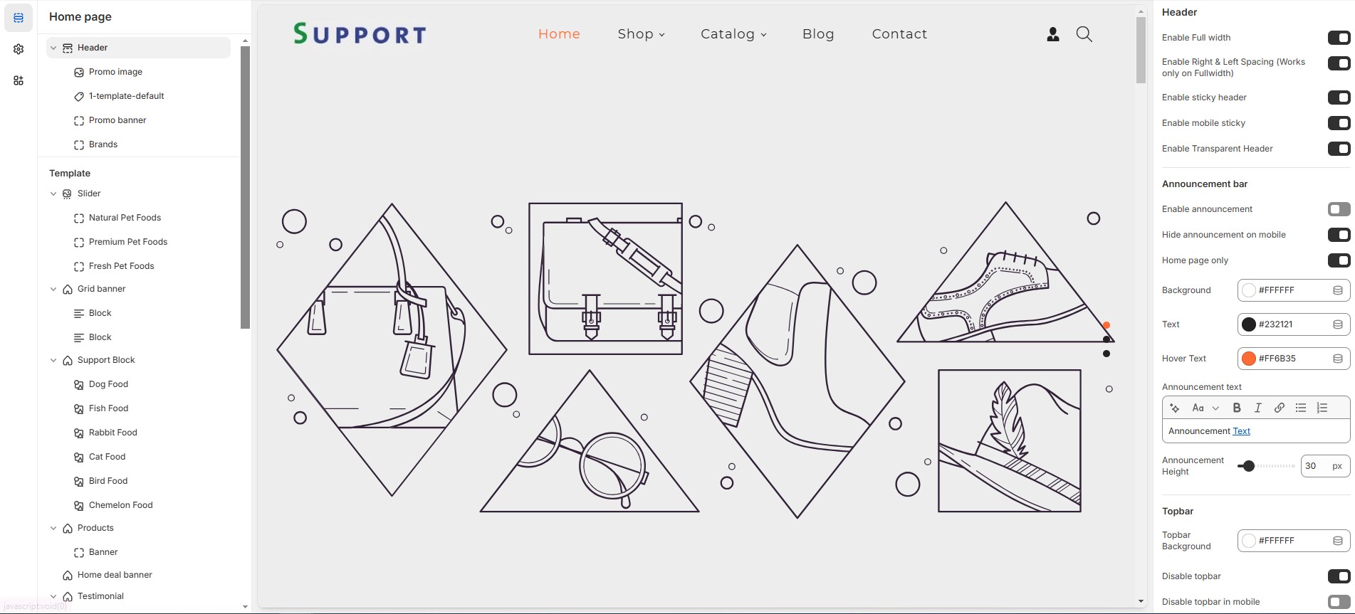
Header
Show Full Width: Expands the header section across the entire screen width.
Enable Right & Left Spacing( (Works only on Fullwidth): Adds spacing on both sides (only works in Full Width mode).
Enable Sticky Header: Keeps the header fixed at the top while scrolling.
Enable Mobile Sticky: Makes the header sticky on mobile devices.
Enable Transparent Header: Allows the header background to be transparent.
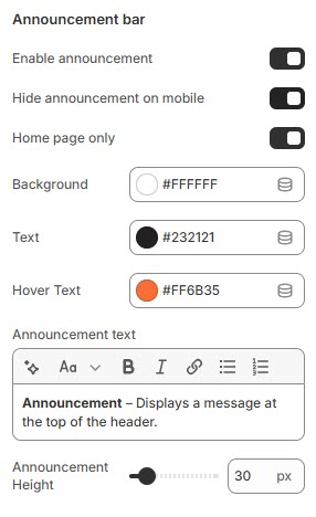
Announcement Bar
Enable Announcement Bar: Displays an announcement bar at the top.
Hide Announcement on Mobile: Option to hide the announcement bar on mobile.
Home Page Only: Displays the announcement bar only on the homepage.
Background: Customize the announcement background color as per your needs (Set your preferred color).
Text: Customize the announcement text color as per your needs (set your preferred color).
Hover Text: Customize the announcement text Hover color as per your needs (set your preferred color).
Announcement text: Customize the announcement bar text.
Announcement Height: Adjust the height (e.g., 30px).
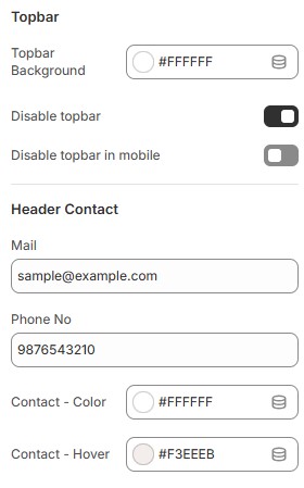
Topbar
Topbar Background: Customize the topbar background as per your needs (Set Your Preferred Color).
Disable Topbar: Option to hide the topbar if not required.
Disable Topbar in mobile: Allows hiding the topbar on mobile devices.
Header contact
Mail & Phone no: Display contact details such as email and phone.
Contact Color: Customize the contact text color (Set Your Preferred Color).
Contact Hover: Customize the contact hover color (Set Your Preferred Color).
Logo Customization:
Logo Image: Upload a custom logo.
Custom Logo Width: Adjust logo width (e.g., 100px).
Logo & Menu Alignment: Set logo position [Logo left, Logo top left, Logo center, Menu bottom ].
Mobile Menu Settings:
Mobile Menu Start From: Adjust when the mobile menu appears [default: 1200px].
Enable Social Links: Show social media icons in the header.
Search Settings:
Search Type: Choose between icon or none.
Enable Predictive Search: Allows users to see search suggestions.
Social Icon Colors:
Social Icon Color: Personalize the social icon color to match your preferences (Choose Your Desired Color).
Social Icon Hover: Personalize the hover color of social icons to suit your preferences (Choose Your Desired Color).
Social Icon Background: Personalize the background of social icons to match your preferences (Choose Your Desired Color).
Social Icon Hover Background: Customize the background color that appears on hover for social icons to match your preferences (Set Your Desired Color).
Header Icons:
Enable Account Link: Display a login/account link (should also enable in dashboard settings).
Enable Cart: Show a shopping cart icon in the header.
Enable Wishlist: Option to enable wishlist and add favorite products.
Enable Compare It: Option to enable compare product and comparison of features.
Header Icon colors:
Icon Color: Customize the icon color (Set Your Preferred Color).
Icon Hover Color: Customize the icon hover color (Set Your Preferred Color).
Icon Background: Customize the icon background color (Set Your Preferred Color).
Icon Hover Background: Customize the icon hover background color (Set Your Preferred Color).
Menu Settings:
Enable Menu Indicator: Display indicators for active menu items.
Primary Menu: Select the main navigation menu.
Enable Secondary Menu: Option to add an additional secondary menu.
Secondary Menu: Select the secondary navigation menu.
Header Background: Customize the menu background color (Set Your Preferred Color).
Menu Text Color: Customize the menu text color (Set Your Preferred Color).
Menu Active Text Color: Customize the active menu text color (Set Your Preferred Color).
Menu Active Background: Customize the active menu background color (Set Your Preferred Color).
Mega Menu Background: Customize the background for the mega menu (Set Your Preferred Color).
Sub Menu Text Color: Customize the sub-menu text color (Set Your Preferred Color).
Sub Menu Hover Color: Customize the hover color for sub-menu items (Set Your Preferred Color).
Menu Bottom Background Color: Customize the background color below the menu (Set Your Preferred Color).
Bottom Menu Border Color: Customize the bottom border color (Set Your Preferred Color).
Parent Menu Font Size: Adjust the font size for main menu items (e.g., 18px).
Sub Menu Font Size: Adjust the font size for sub-menu items (e.g., 18px).
Money Options:
Enable Currency Selector: Allow users to switch currencies.
Display Sale Tag: Show a sale label for selected menu items.
Sale: Add the tag name as required to the theme
Map Sale Tag with Menus: Enter menu names separated by commas.
Display New Tag: Show a new label for selected menu items.
New: Add the tag name as required to the theme
Map New Tag with Menus: Assign menus for new arrivals.
Display Hot Tag: Show a hot label for selected menu items.
Hot: Add the tag name as required to the theme
Map Hot Tag with Menus: Assign menus for hot-selling items.
Adding blocks in header
In header section can click and add a block
You can select the required block types and create a megamenu
For example you upload a Promo image, add links, or embed menu.
Added blocks can also be Reorder by dragging them up or down.
Click save