FAQ page
The FAQ page addresses common questions to help users find answers quickly and improve their experience on the website.
How to create faq page
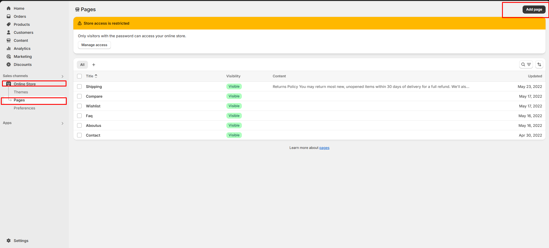
Step 1: Go to Online Store > Pages.
Step 2: Click the Add page, it navigates to another page.
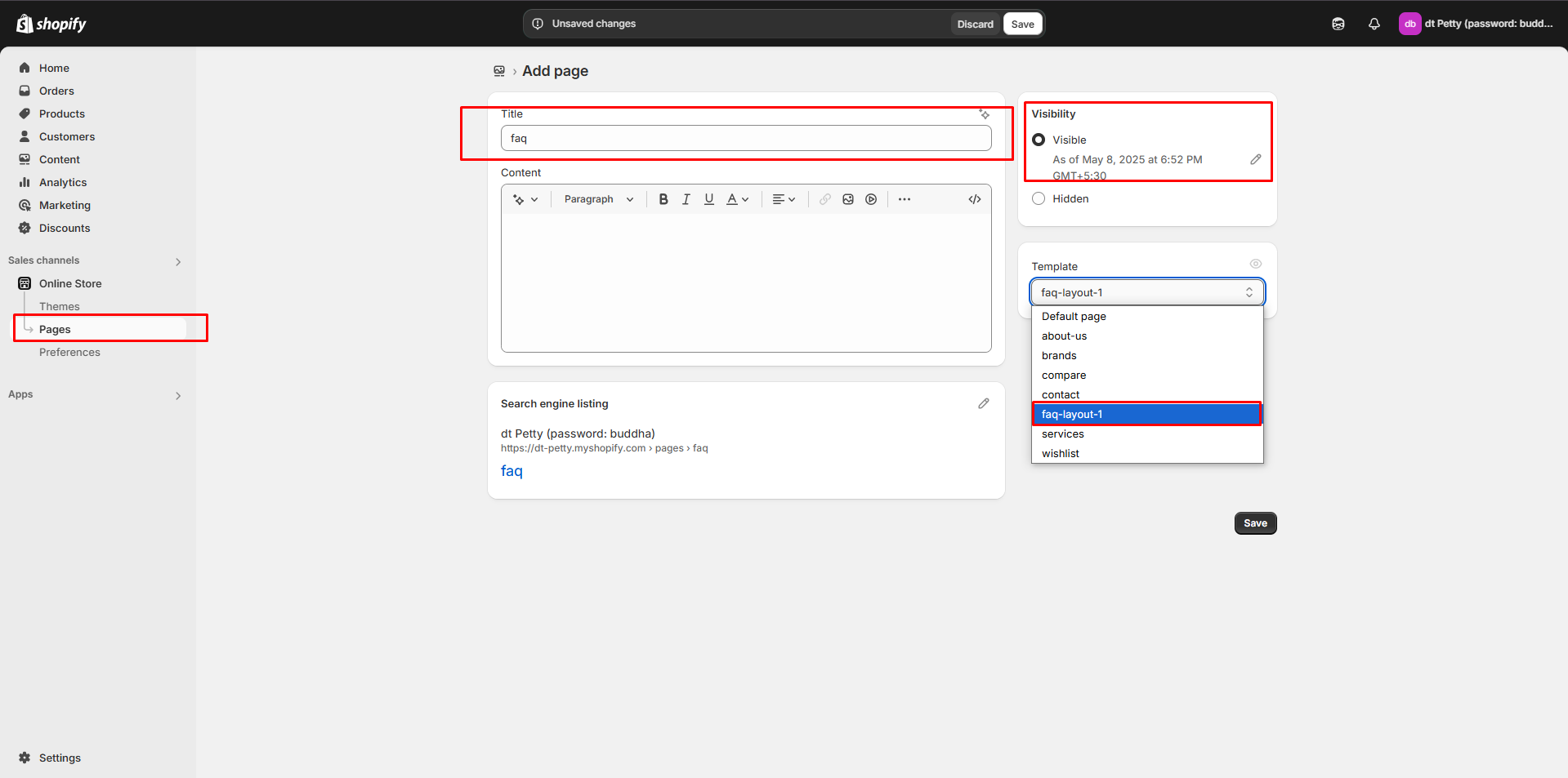
Step 3: Enter the required Title for the page.
Step 4: Select FAQ from the Theme template drop-down menu in the Online Store section.
Step 5: Add content, media, etc. in the customizer.
Step 6: Save the changes.
Customization of FAQ
To add questions and answers to the FAQ, follow the steps below.
Step 1 : Go to Online Store > Themes > Customize
Step 2 : On the left sidebar, you can add sections for the faq.
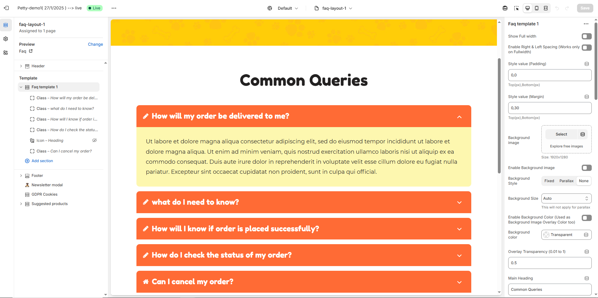
Step 3 : Select the FAQ page from the Customizer > Add Section > Faq or Collapsible Content
Step 4 : Select a Collapsible row to add Question ,Answer and subheading with icons.
Step 5 : On the right sidebar, you can give the questions,answers,subheading and icon for faq.
Heading as Question and Row content as Answer for the Question.
Step 6 : Save the process.
Faq Template Customization
Show Full Width: Expands the featured frequently asked question section across the entire screen width.
Enable Right & Left Spacing (Works only on Fullwidth): Adds spacing on both sides (works only in Full Width mode).
Padding (Top, Bottom): Adjust the inner spacing above and below the section. Top(px), Bottom(px).
Margin (Top, Bottom): Adjust the outer spacing above and below the section. Top(px), Bottom(px).
Enable Background Image: Allows adding a background image for the section.
Background Image: Upload the image (Recommended size based on design requirements).
Background Style: Choose background style ( Fixed, Parallax, or None ).
Background Size: Choose background size ( Auto, Cover, Contain, Repeat).
Enable Background Color: Enable a background color (also used as an overlay color).
Overlay Transparency: Adjust the transparency of the overlay (value between
0.01and1).Main Heading: Customize the Main heading.
Sub Heading: Add a short text to the content.
Description: Add text to share information about the collection.
Link Text: Customize the text for the clickable link.
Link URL: Paste a URL or search for an internal link.
Color Customization
Heading Color: Customize the heading color (Set Your Preferred Color).
Sub Heading Color: Customize the sub-heading color (Set Your Preferred Color).
Description Color: Customize the description text color (Set Your Preferred Color).
Button Background Color: Customize the button background color (Set Your Preferred Color).
Button Text Color: Customize the button text color (Set Your Preferred Color).
Button Hover Background Color: Customize the hover background color for buttons (Set Your Preferred Color).
Button Hover Text Color: Customize the hover text color for buttons (Set Your Preferred Color).
Heading position : Choose heading position (Left, Right, Center).
Block Settings
Block Style: Choose the block style (Style 1,Style 2, Style 3, Style 4).
Block Text Position: Choose text position (Left, Right, Center).
Overall Radius: The overall radius can be rounded using the radius property. (Leave empty for default border radius).
Grid gap: Customizer spacing between columns.
Enable Box Shadow: Adds a shadow effect to the banner.
Enable Heading Icon/Image (Set the icon/image inside the blocks): Allows adding a Icon and Image.
Heading Icon / Image size: Customizer icon and image size.
Segmented Layout:
Enable Segmented Layout: Allows adding a segmented layout.
Segmented Layout Gap: Customizer spacing between segmented layout column.
Block Color Settings:
Faq Border Color: Customize the faq border color (Set Your Preferred Color).
Faq Heading Color: Customize the faq heading color (Set Your Preferred Color).
Faq Heading Bg Color: Customize the faq heading background color (Set Your Preferred Color).
Faq Content Color: Customize the faq content color (Set Your Preferred Color).
Faq Content Bg Color: Customize the faq content background color (Set Your Preferred Color).
Image: Upload the image (Recommended size based on design requirements).
Icon
Icon (Enable Heading Icons from section settings) : Upload the image (Recommended size based on design requirements).
Heading : Customize the Heading.
Description : Add text to share information about the description.
Class
Font Awesome class (Enable Heading Icons from section settings) : Add the font awesome icon (Eg., fa fa-instagram).
Heading : Customize the Heading.
Description : Add text to share information about the description.
Advanced Customization
Custom Class: The Shopify allows you to apply unique CSS styles to specific sections, blocks, or elements within your theme.